

This is a collection of long-term forecasts based on quantitative data from diverse sectors. Long-term means 20 years or more. Diverse means forecasts in a wide range of activities such as transportation, education, food, shelter, entertainment, technology, etc. You can help grow the collection. Please check our list of desired indicators and submit suggestions to extrapolations@kk.org. We're also collecting and crossposting any and all attempts to extrapolate the future on Tumblr and Pinterest. You can follow us on Twitter too.
Social Media Consumption: Extrapolations
ASK
Extrapolate to 2050:
Individual daily consumption of all media (web-based and traditional)
Individual daily consumption of social media
All Media
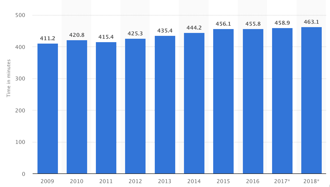
Zenith (a media agency) tracks this info on a global scale (I’ve not found other sources). They’ve only been publishing reports for the last four years, but I found a Recode article that interviews the head of forecasting at Zenith (Jonathan Barnard). This article provides historic data back to 2010, and forecasts to 2019, contrasting North America with the global average. The article was published in May 2017, and Zenith published a new report in 2018 with slightly different data for the last few years and looking forward, but the most recent report does not provide the context of the previous 10 years. For consistency of methodology, I’ve just used the data quoted by Recode for the following extrapolation.
[Excerpts from all four published Zenith reports are below, showing the yearly revision to their data. In summary, the estimates become more conservative with each subsequent report up until the latest report, which shows a jump again.]
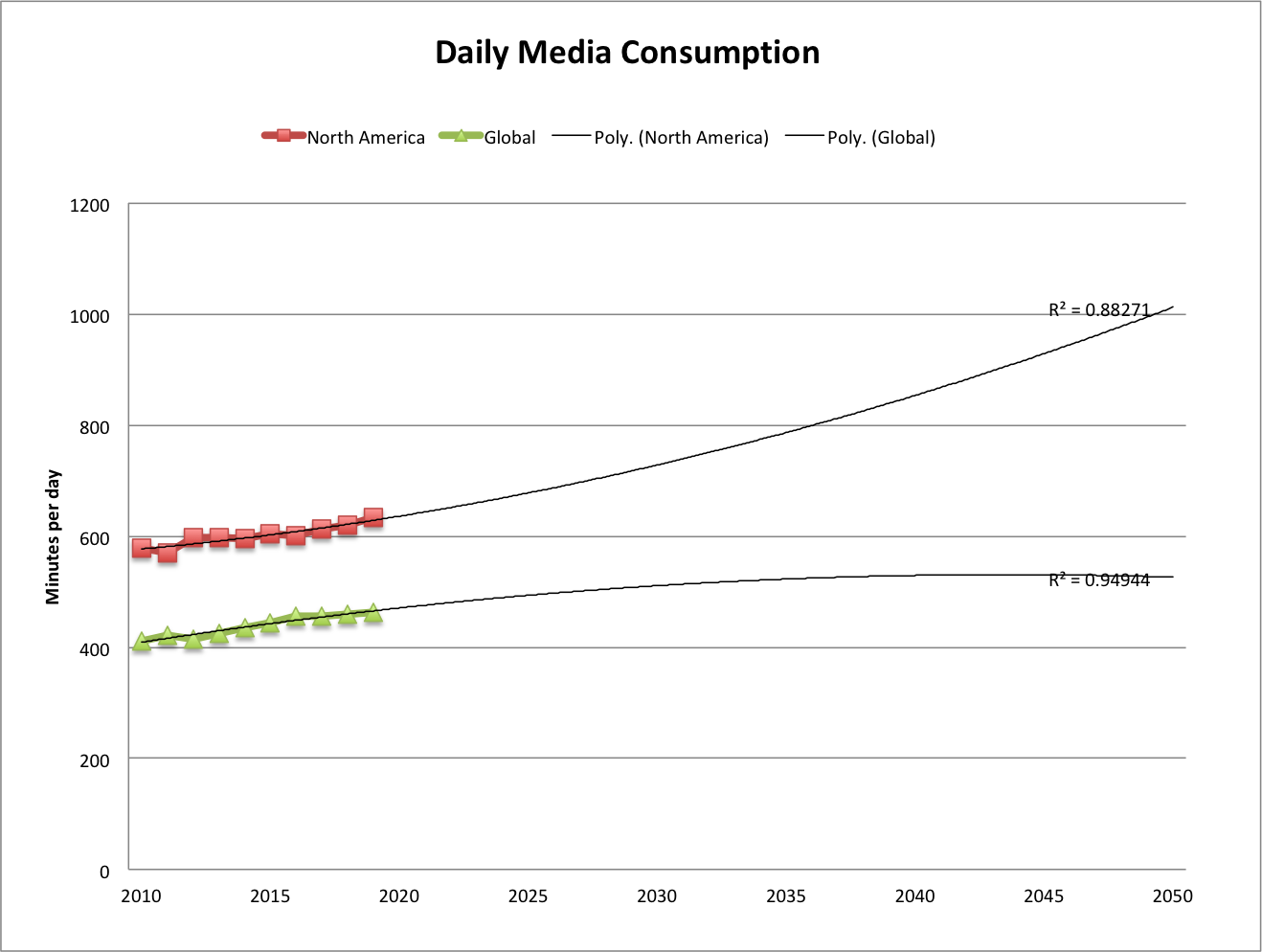
[This and all extrapolations in this post in my file media-consump-forecast.xlsx]
src:
Recode, May 2017
“People consumed more media than ever last year — but growth is slowing”
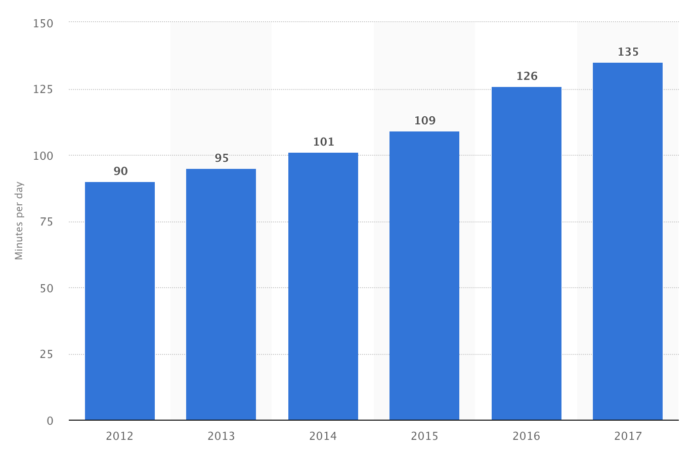
figure: Average individual daily media consumption in minutes
citing Zenith (appears to be from their 2017 report, including historic data available not freely accessible).
*
Here are excerpts from the press releases for the annual “Media Consumption Forecasts” by Zenith.
From the 2018 Report:
2018: 479 minutes per day consuming media
12% more than in 2011
2020: 492 min/day
From the 2017 report:
2019: less than 1% growth
2017: same as 2016
2016: 456 min/day
2010: 411 min/day
From the 2016 report:
2018F:448 min/day
2015: 435 min/day
2010: 403 min/day
From the 2015 report:
2017F:506 min/day
2015: 492 min/day
2014: 485.3 min/day
2010: 461.8 min/day
***
Social Media
eMarketer and Statista both provide estimates of daily social media consumption. The eMarketer figures cover the US, and the Statista figures are global.
Upon first inspection of the data, the Statista figures seem to be roughly 3X higher than eMarketer’s figures, a disparity that does not agree with my understanding of the variation by country (see We Are Social chart below). I’m quite confident that Statista’s data actually comes from marketing firm Global Web Index, and their recent report (which does not include all the historic info available at Statista) makes frequent passing reference to the increasing amount of time users are watching video on social platforms. In reading various qualitative discussions of social media use, I find many sources group YouTube and Facebook minutes of use together under the social category.
When eMarketer’s social and video minutes are combined, they come in closer range to Statista’s figures, so I believe this is a good rough approximation.
Here’s the extrapolation for both eMarketer (combined social and video) and Statista:
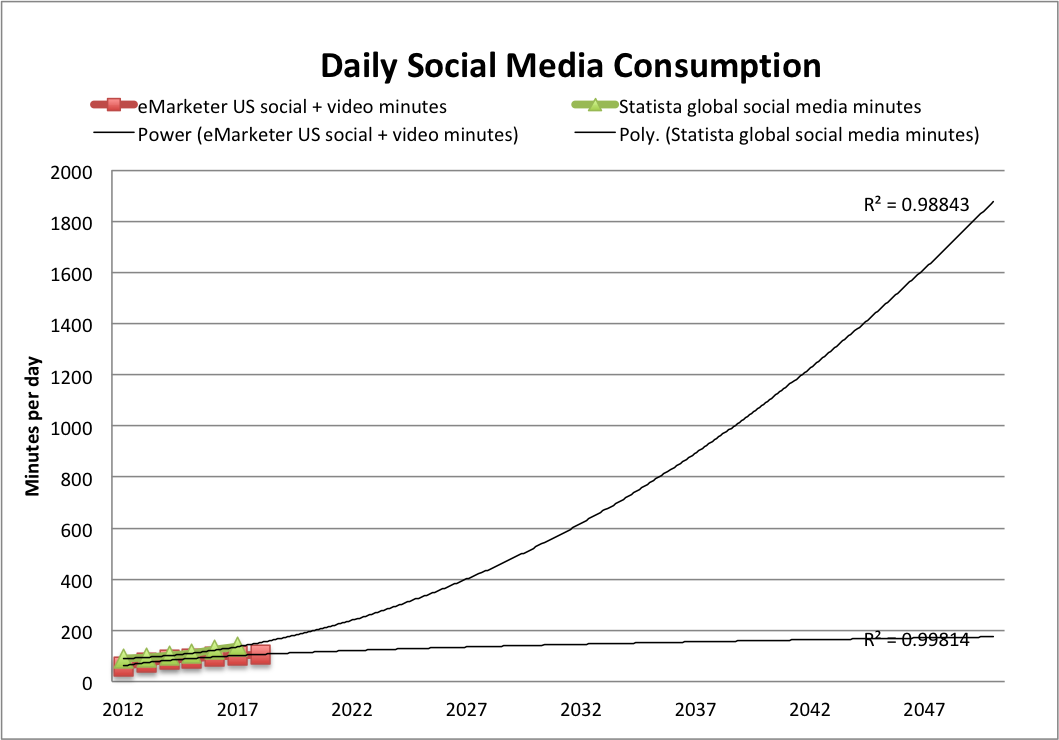
Note: The trendline of best fit for most of our extrapolations doesn’t fit the eMarketer data very well, so instead I’ve used a power trendline. The polynomial(2) trendline we often use does fit the Statista data pretty well, however. (You see both in the figure above)
I also noticed in reading qualitative discussions that Facebook and YouTube’s average daily minutes are very similar, with video getting a bit more time, and this is also the shown in eMarketer’s data, with the gap slowly widening in video’s favor. I’ve extrapolated eMarketer’s social and video figures separately to show how that divergence might take shape (again, the power trendline seemed to fit best).
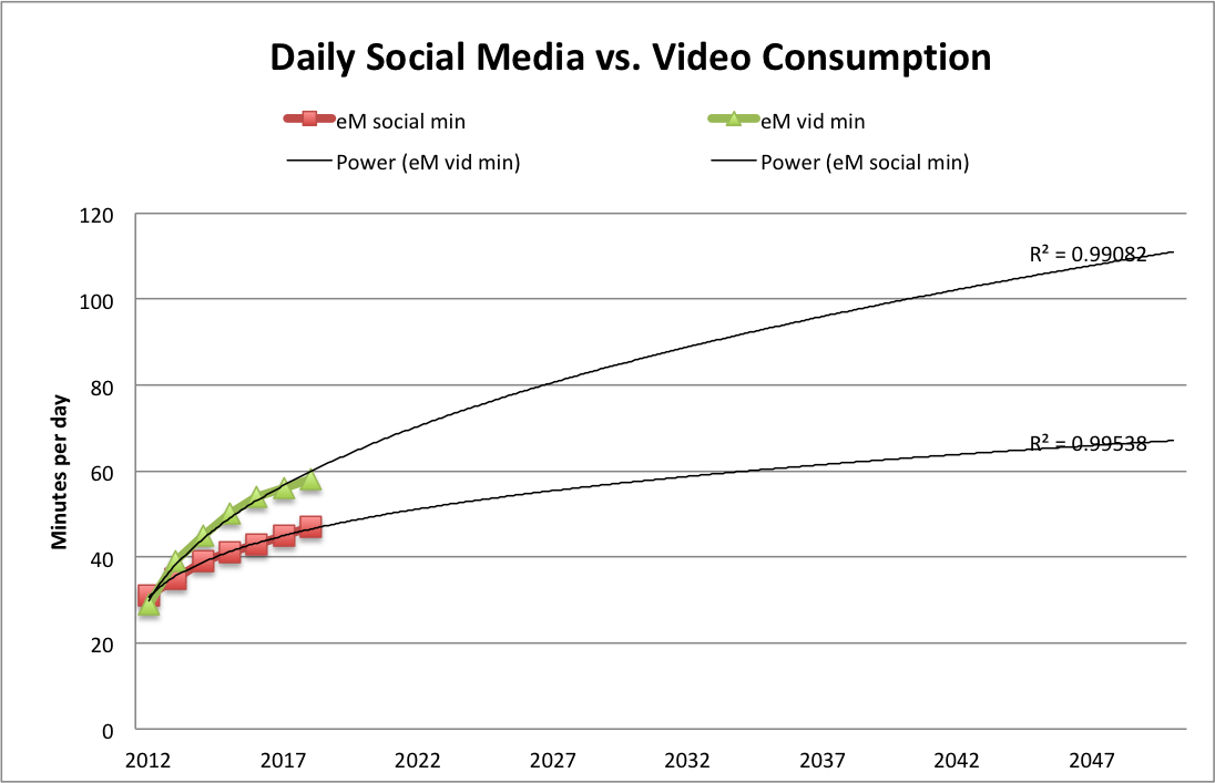
No surprise to see video pulling ahead of social, and I’m certain that marketing research focused on the growth of online video would suggest a much steeper curve.
Meanwhile, and also no surprise, here’s a chart (from Recode, citing Zenith) showing that Internet consumption is overtaking traditional TV consumption (from the same source as the Global/N.American overall media consumption figures above).
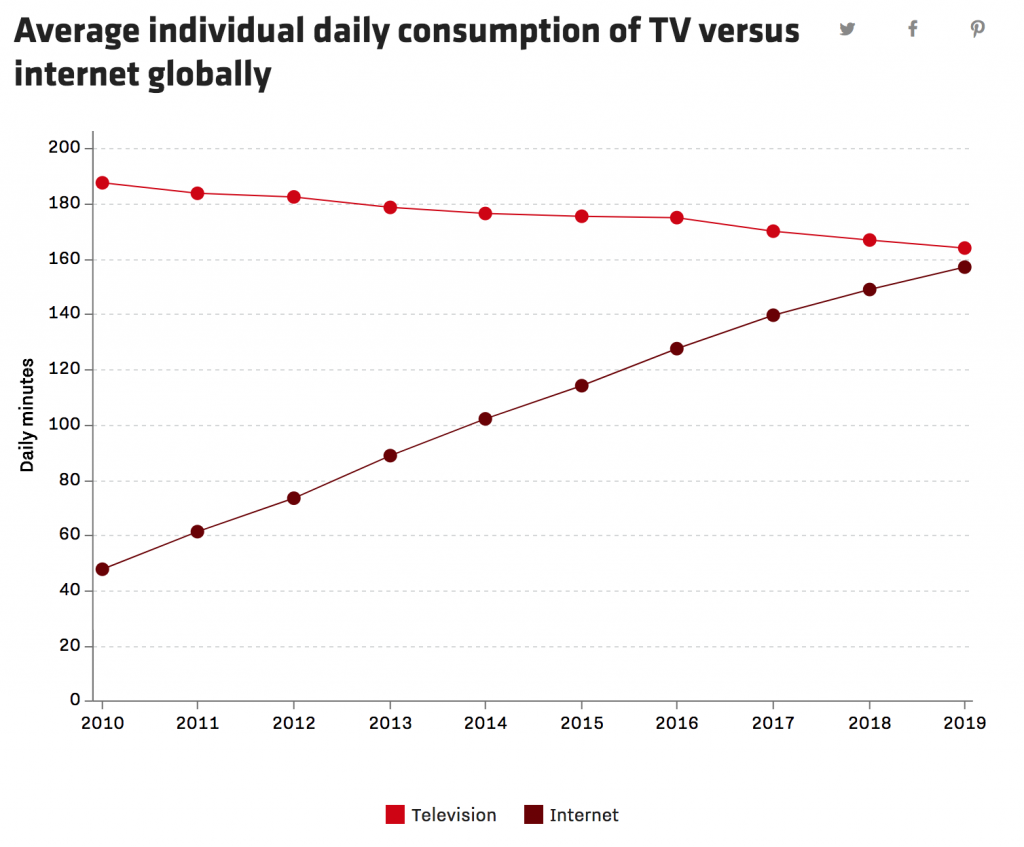
[Click through to the great interactive version at Recode.]
Another ad media firm, GroupM, also predicts online time overtaking traditional TV this year.
In line with that, this year (2018), globally, advertisers are expected to spend more online than on television for the first time. Interestingly, social media ad spending is expected to rise 21% to $58 billion while video ad spending is rising 19% to $32. (Recode citing Zenith)
Here’s a snapshot from We Are Social showing how social media consumption varies from one country to another in 2017.
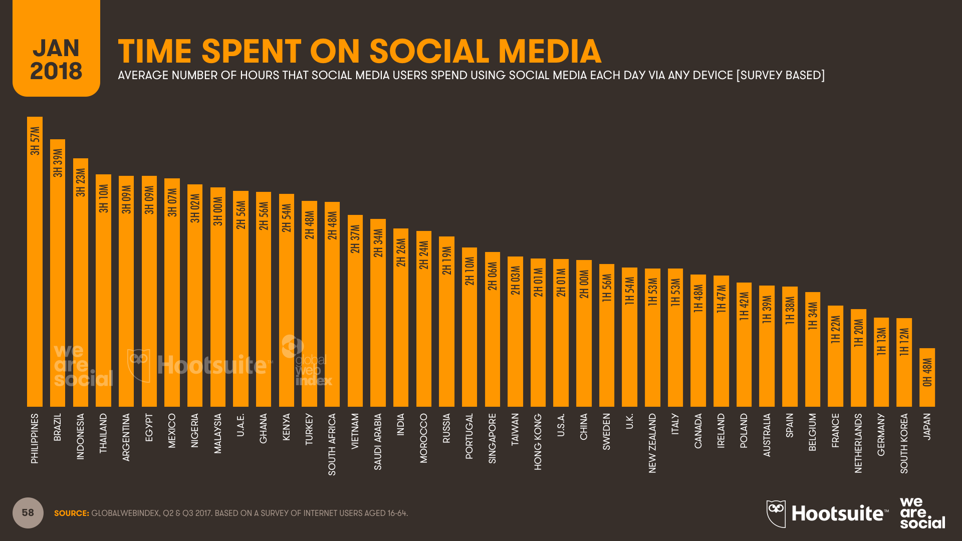
srcs:
eMarketer, June 2016
“Growth in Time Spent with Media Is Slowing”
Note:
eMarketer aggregates data from various research firms and they don’t offer much detail (at least, not to unpaid customers). I don’t know if these figures are based on consumer surveys or if they are based on data provided by service providers.
Statista (citing ??, 2017), 2018
“Daily time spent on social networking by internet users worldwide from 2012 to 2017”
Note:
Statista does not give the name of the original source (to unpaid customers), but they do specify that this data is based on worldwide, online consumer surveys of adults aged 16-64. Statista also reports that the survey question asks, “Roughly how many hours do you spend engaging with/connected to social networks or services during a typical day?” The source must be GlobalWebIndex, which conducts web-based surveys. Their latest report (2018) estimates current social media time exactly as reported by Statista. Their press release here describes the same survey question, and the same survey audience (16-64 year olds).
Entrepreneur, in Jan 2018 (date established via InternetArchive), published the following comparative daily consumption figures:
youtube: 40min/day
facebook: 35min/day
Snapchat: 25min/day
Instagram: 15min/day
Twitter: 1min/day
Media/Internet Time Allotment
Overall Media Allotment
src:
Statista, accessed May 2018
citing: info not available (likely eMarketer)
*
CC’s Note: eMarketer tracks the way people spend their time with media, showing comparison between desk/laptops, mobiles, non-streaming TV, radio, print
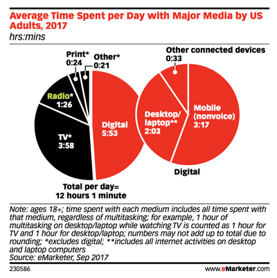
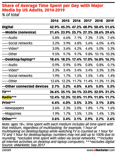
src: eMarketer, Sep 2017
via InsideRadio, Oct 2017
“EMarketer: Adults Spend Half Of Daily Media Usage On Digital”
*
UK Adults’ media time has plateaued
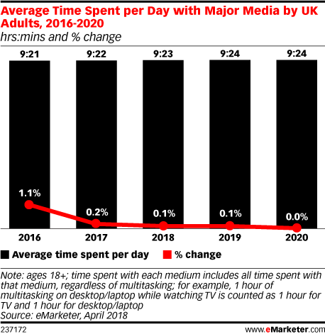
“The way that people consume media will continue to change,” said eMarketer’s UK analyst, Bill Fisher. “Many traditional habits are simply transitioning over to digital devices and platforms, while digital-only habits continue to proliferate. However, what’s apparent from this forecast is that UK adults have reached a plateau. While the media mix may ebb and flow, and it will increasingly flow toward mobile, adults’ media consumption capacity has reached its peak.”
*
src: eMarketer
small thumbnails retrieved 5/14/18
permalinks (data restricted by paywall)
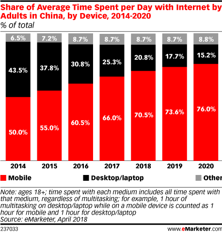
Average time spent per day with internet by adults in China by Device 2014-2020
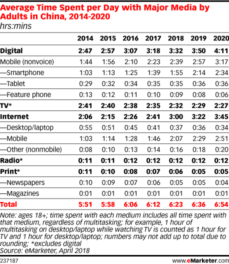
Average time spent per day with major media by adults in China 2014-2020
*
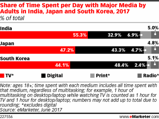
In 2017, daily time spent with digital media among adults will top 3 hours in Japan (3 hours 5 minutes) and South Korea (3 hours 26 minutes). Those in India will average less than half that time (1 hour 18 minutes), with digital accounting for just under one-third of total daily time spent with media.
src:
eMarketer, June 2017
*
Daily time spent on social networking by internet users worldwide from 2012 to 2017 (in minutes)
src:
Statista, accessed May 2018
citing: untracked
*******
Mobile Time Allotment
FIGURE A3.1
Traffic Daily Profiles of the Five Major mobile Applications in North America (2020)
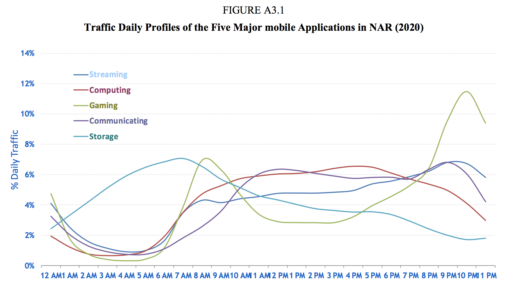
Figure A3.1 shows the daily profiles of the five major mobile applications in North American Region (NAR), namely, streaming (audio and video), computing (cloud processing, office productivity, other mobile applications), storage (media sharing, backup and device synchronisation), gaming (casual, interactive or emerging applications), and communicating (voice, video, e-mail and M2M). All these represent human behaviours and they are similar across geographies.
src:
International Telecommunication Union, July 2015
“Rep. ITU-R M.2370-0: IMT traffic estimates for the years 2020 to 2030”
P.40-41
citing:
Source: Bell-Labs, Alcatel-Lucent, 2015.
[CC’s note: Haven’t been able to track this down]
*
Mobile traffic distribution over different applications
Contrast with voice usage
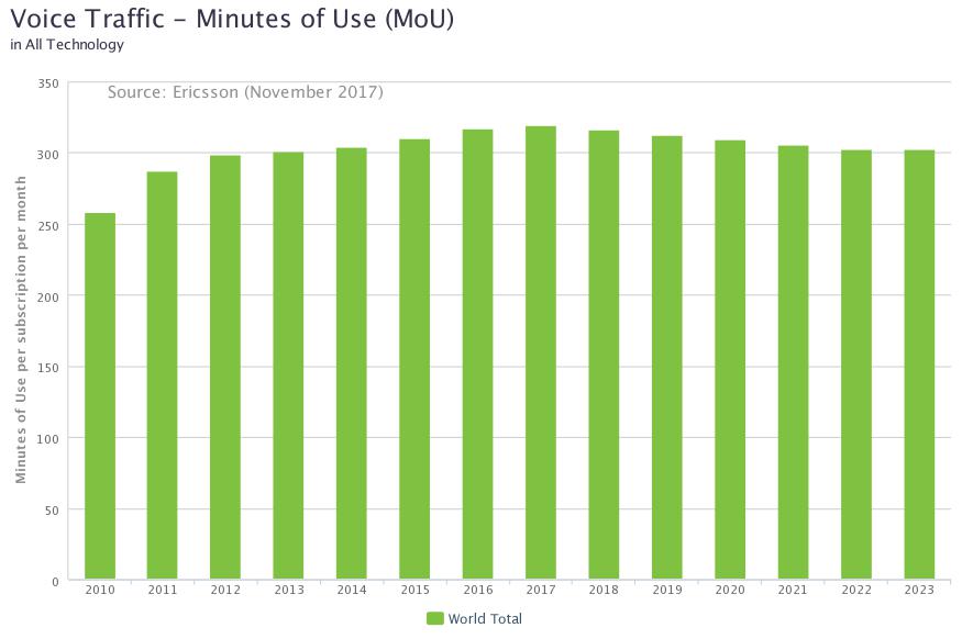
[Data here: Ericsson-Minutes-of-voice-monthly-2010-2023.xls]
src:
Ericsson, Accessed May 2018
Traffic Exploration [interactive data tool]
*
Sandvine, a Canadian network intelligence firm, tracks traffic composition. They’ve published a few reports with the current and previous year’s data, but I haven’t found anything more longitudinal. The reports describe peak period traffic composition across the following categories: real-time entertainment, marketplaces, storage, filesharing, web browsing, gaming, social networking, communications, and other. There are separate charts for mobile and fixed access.
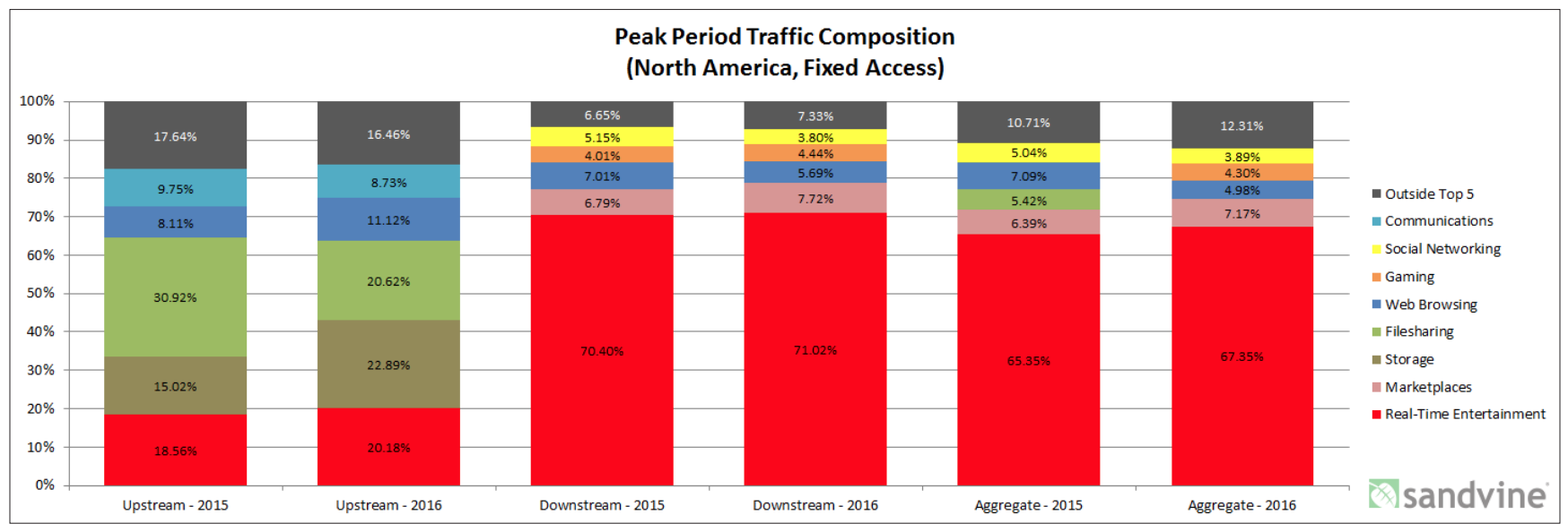
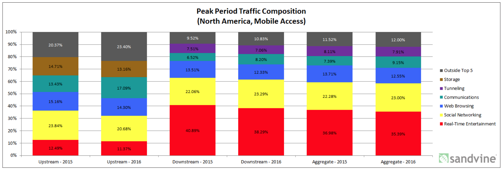
from
“2016 Global Internet Phenomena: Latin America and North America”
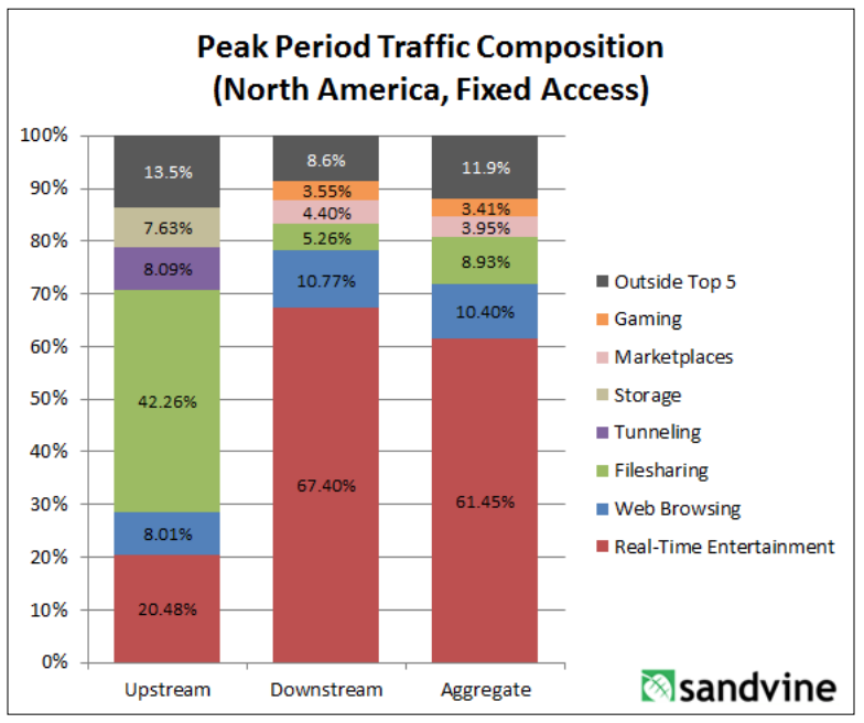
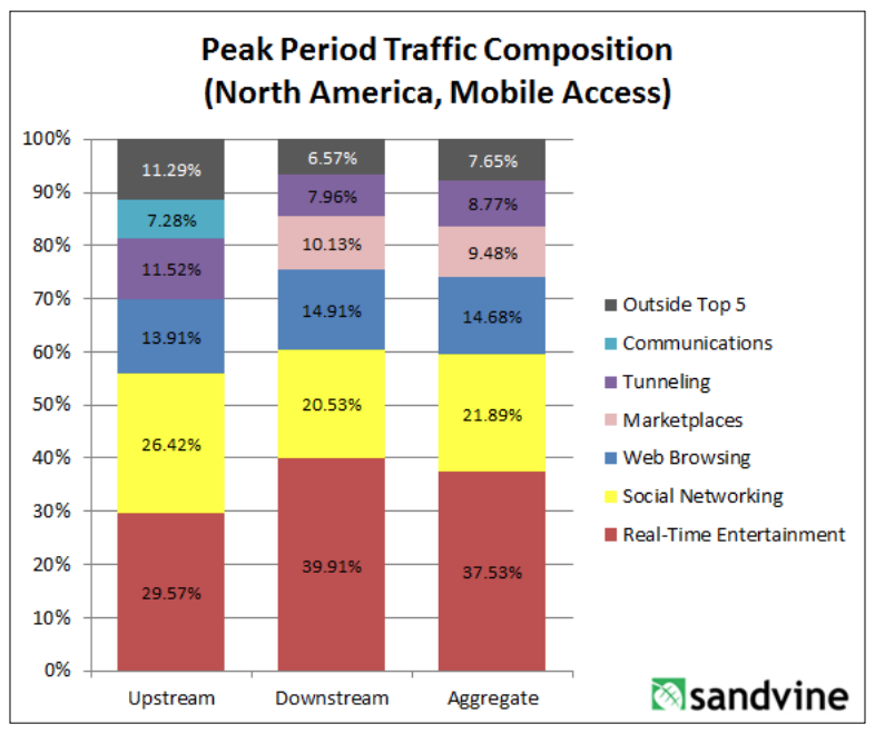
from
“Global Internet Phenomena Report: 2H 2013”
CC’s Note: I’ve not been able to find a more recent version of the report. Sandvine was acquired recently, although the report author is still with the company. Could contact him to ask. Dan Deeth: ddeeth@sandvine.com
*
Comscore is tracking differences between desktop and mobile internet usage.
CC’s note: Not sure if historic data are aggregated, but here’s a sample of recent statistics (covering US, Canada, France, Germany, Italy, Spain, UK, Argentina, Brazil, Mexico, India, Indonesia and Malaysia)
Smartphones are the dominant platform in terms of total digital minutes, in every region Comscore examined.
Most pronounced in India – 89% total minutes
Least noticeable in Canada – 43% of total minutes (42% desktop, 15% tablet)
US: 60% (30% desktop, 10% tablet)
Mobile minutes are overwhelmingly spent with apps – over 80%
Top apps (everywhere, in various rankings) include:
Google Search, Whats App, Facebook, YouTube, Google Play, FB Messenger
Three largest categories where digital time is spent:
Multimedia (includes several large video streaming services), Social Networking, Instant Messengers
Looking specifically at mobile digital time, the top four categories are:
Entertainment, Social Media, Instant Messaging, and Games
On average, Social Media has the largest average share of mobile minutes, but Entertainment is larger in the US and Canada.
Among Social Media apps, Facebook, totally dominates, followed by Instagram, then Snapchat, then Twitter (Twitter’s share is tiny).
Among Messaging apps, WhatsApp totally dominates, then Facebook Messenger (less than half), then WeChat (very small share).
The report includes visualization of platform preferences for certain categories. Business/Finance (which includes banking) shows the most even split between mobile and desktop reach. In the majority of markets, retail is heavily biased toward mobile. News/Information is overwhelmingly biased toward mobile.
(shown for UK and India – both show a fairly even split between desktop and mobile for banking minutes).
The report also includes visualization of subtle seasonality in certain categories of content (shown for UK and Brazil).
src:
Comscore, 2018
“Global Digital Future in Focus”
Whole-Day Time Allotment
ASK: Historic trends in time allotment? Global data?
SUMMARY
The Bureau of Labor Statistics has conducted the American Time Use Survey (ATUS) annually since 2003. This is the first federally funded, rigorous time use survey, although other large scale surveys have been conducted in the mid 20th century. Smaller scale time-use diaries were also collected going back to the early 19th century. Much of this data is US-specific, but the UN has aggregated time-use surveys into regional categories.
FINDINGS
Wall Street Journal, in 2016, created some nice, interactive graphics illustrating the changes reflected in the ATUS from 2003 through 2015.
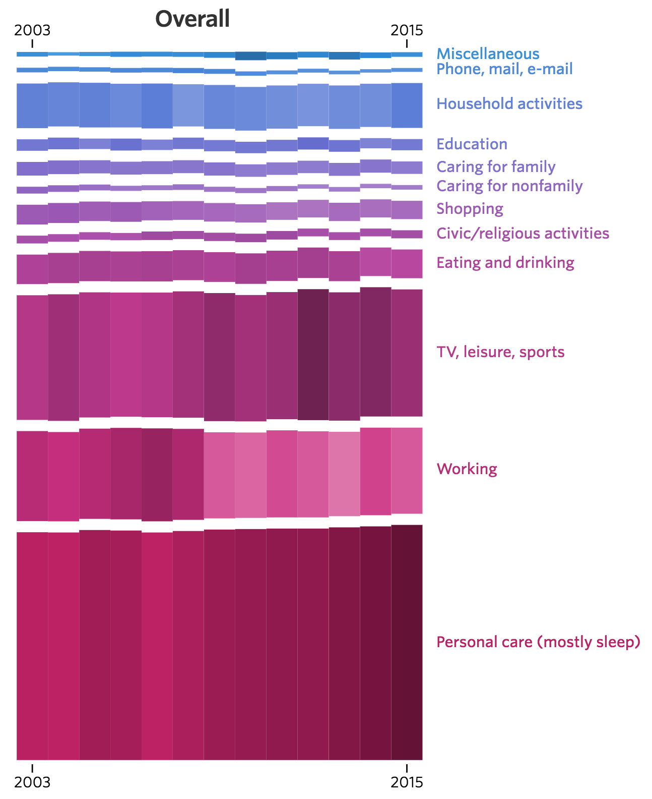
[Click for larger. Visit source for interactive version]
Excerpt:
Americans overall are working less and sleeping more than they were a decade ago, trends that point to an aging population and fewer people in the workforce. But among those who have a job, people are working more. And in general, men spend more time than women on leisure activities, while women sleep about a half-hour more each day.
Additional charts at WSJ show breakdown by sex, employment status, age, and whether children are in the home.
src:
Wall Street Journal, June 2016
“Changing Times: How Americans spend their day reflects a shifting economy and population.”
*
Here are links to the historic BLS time-use data
Data for 2003
See Tables 1 & 2 (pp.9, 10)
src:
BLS, Sep 2004
“Time-Use Survey— First Results Announced By BLS”
Historic tables all linked here
*
Diary data collection in the US dates back to the early part of the 19th century. The first large-scale national sample time use survey was conducted in 1965/1966. Data from this study, and others through 1981, are available via University of Michigan’s Institute for Social Research (ICPSR)
Americans’ Use of Time Series, ICPSR
*
Trends in earlier Americans’ Use of Time Project surveys, 1965-1995
src:
John Robinson, Geoffrey Godbey, 1997
Time for Life: The Surprising Ways Americans Use Their Time
Excerpts:
Distribution of Time in Productive Activities by Gender in Fourteen Countries
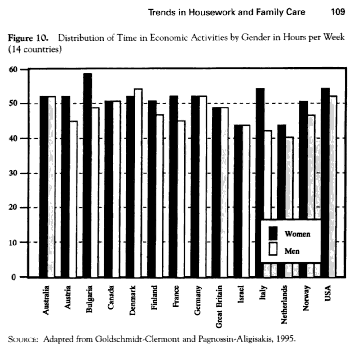
(p.109)
Trends in Free Time and Its Components, 1965-1995 (341)

(p.126)

(p.145)
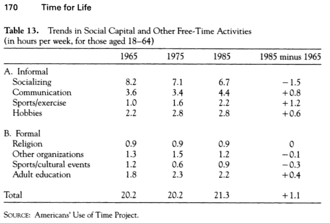
(p.170)
Trends in Different Types of Time for Women and Men, 1965-1995 (348)
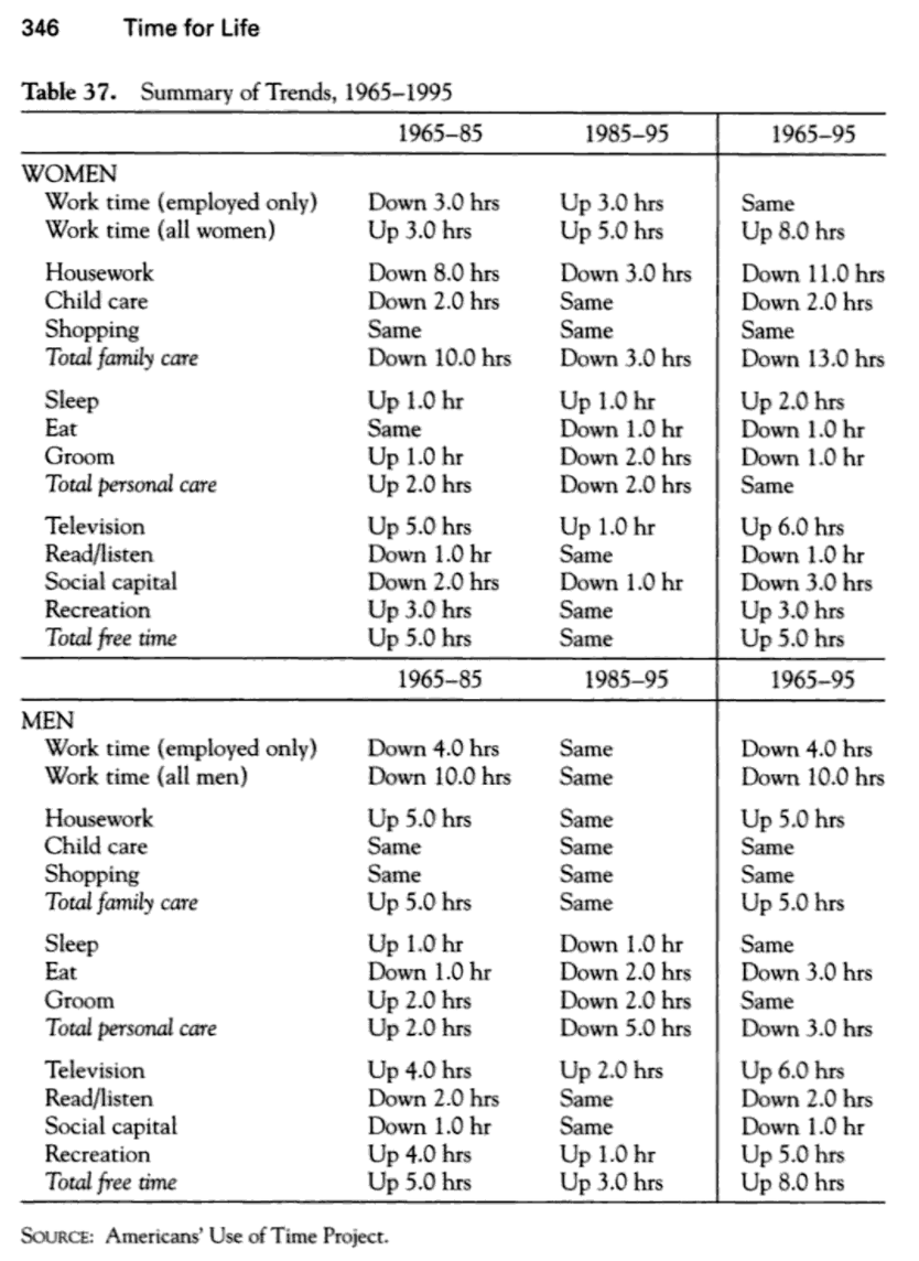
(p.346)
src:
Transportation Research Board and Institute of Medicine, 2005
“Does the Built Environment Influence Physical Activity?: Examining the Evidence — Special Report 282”
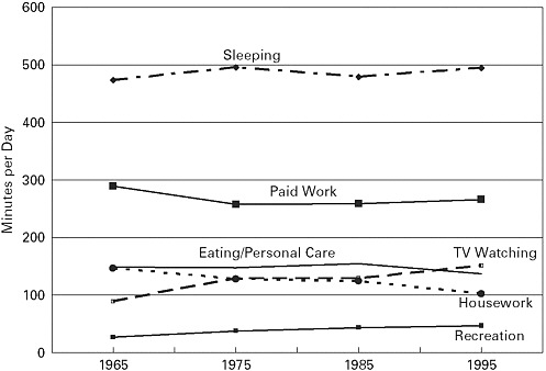
p.78, Figure 3-8 Time use, 1965–1995 (ages 18–64).
(data from Robinson & Godbey, above, although the preview of that info is not available in Google)
*
Global aggregation of time-use surveys
United Nations Development Programme, 2015
“Time Use Across the World: Findings of a World Compilation of Time Use Surveys”
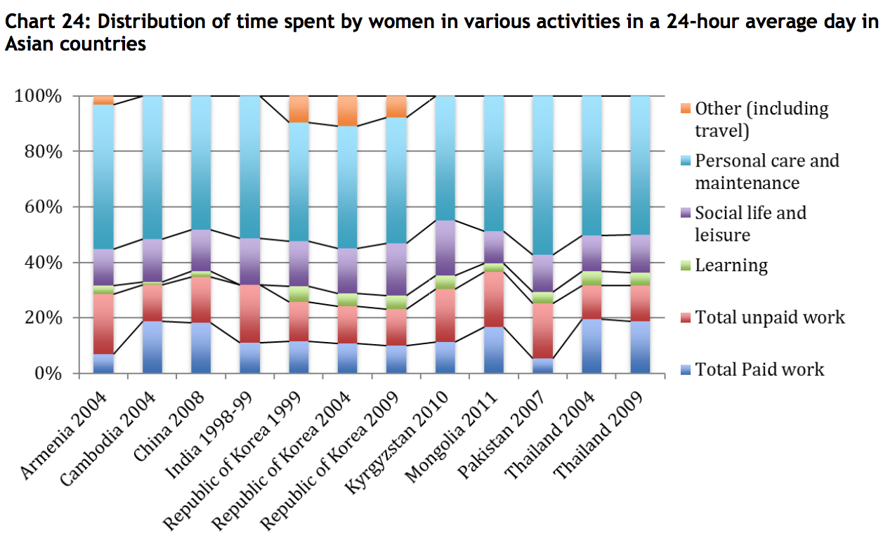
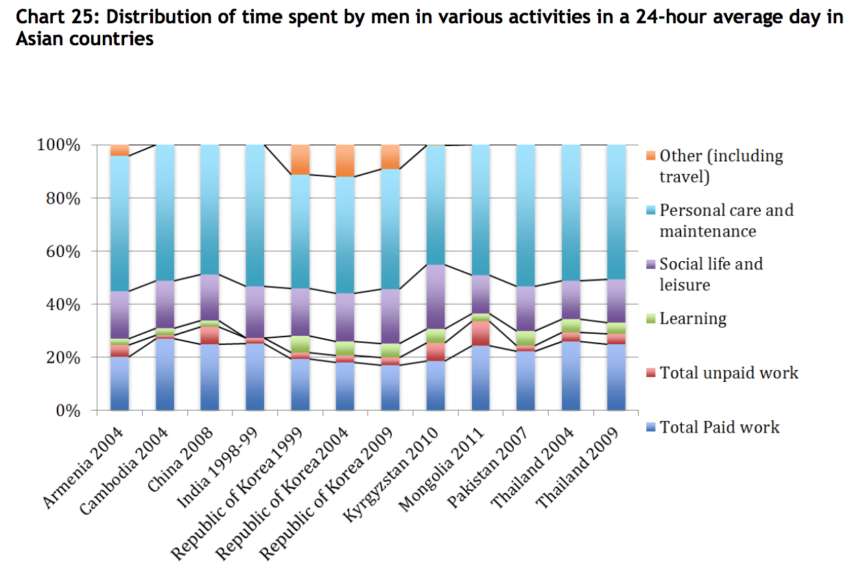
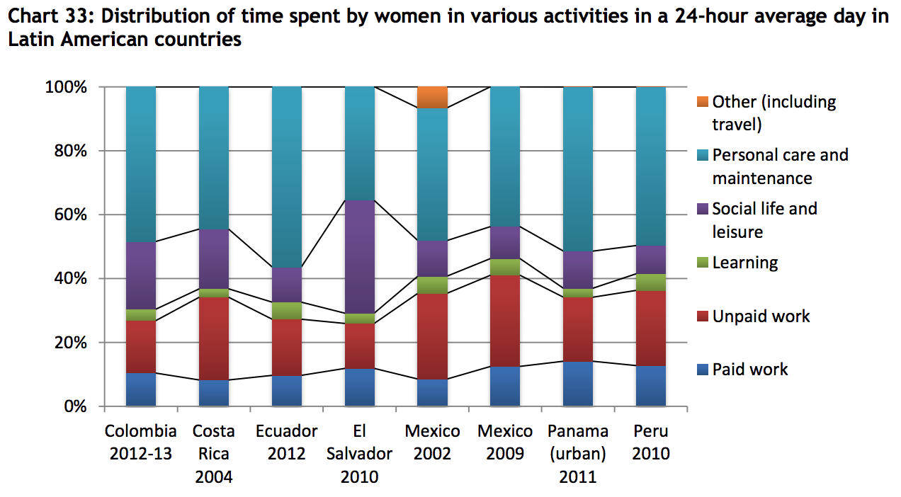
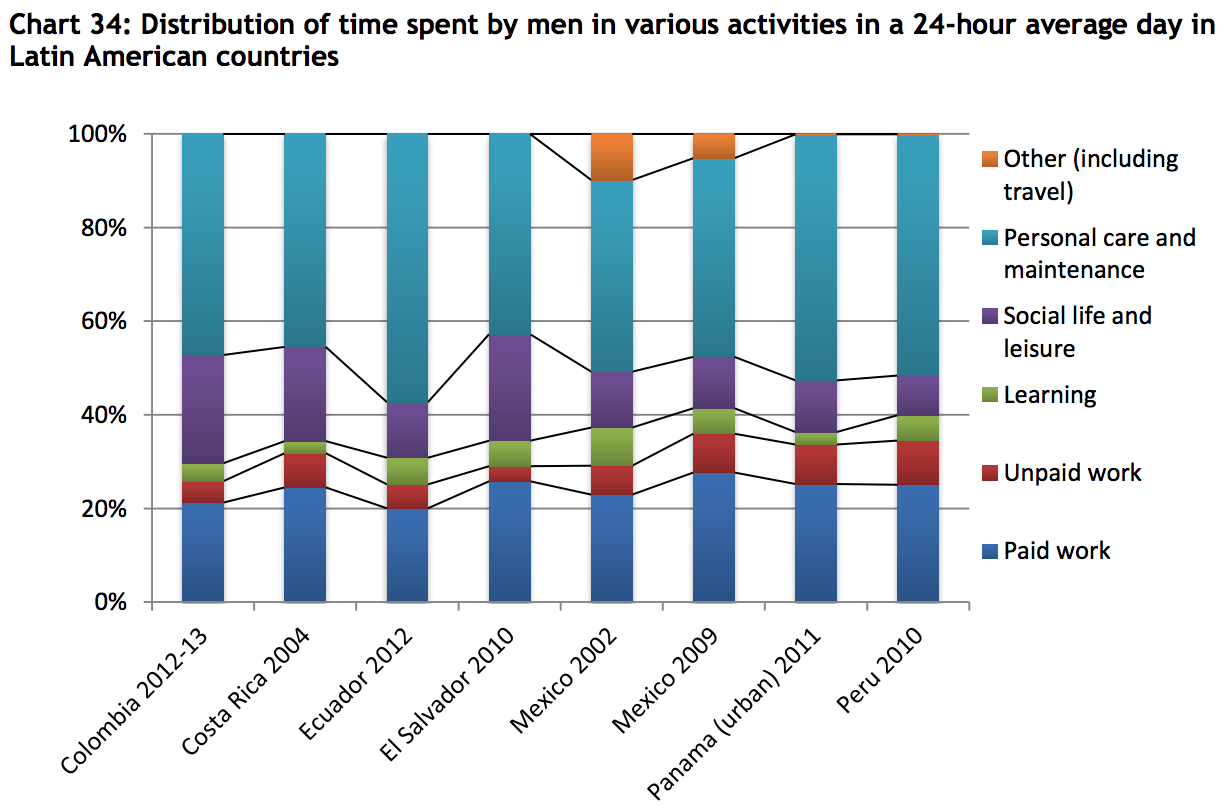
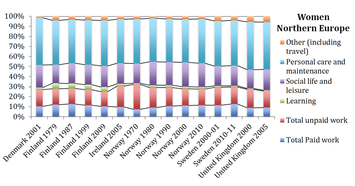
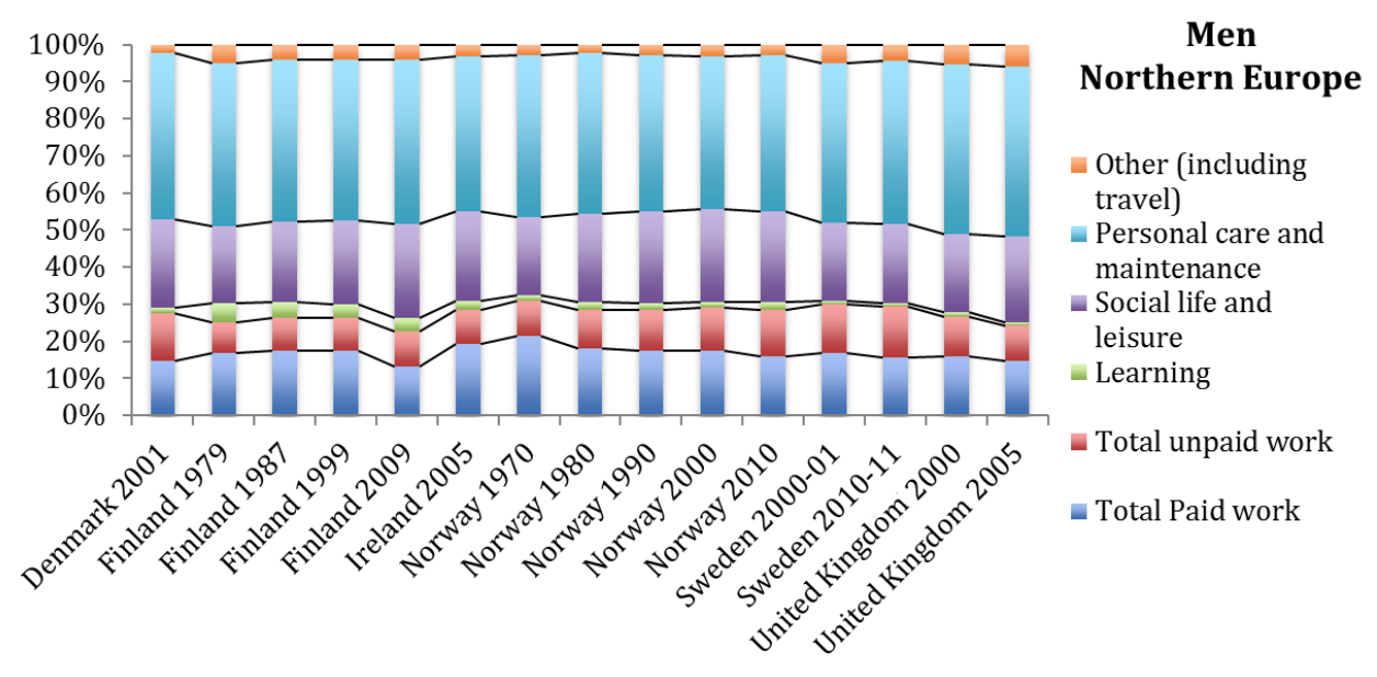
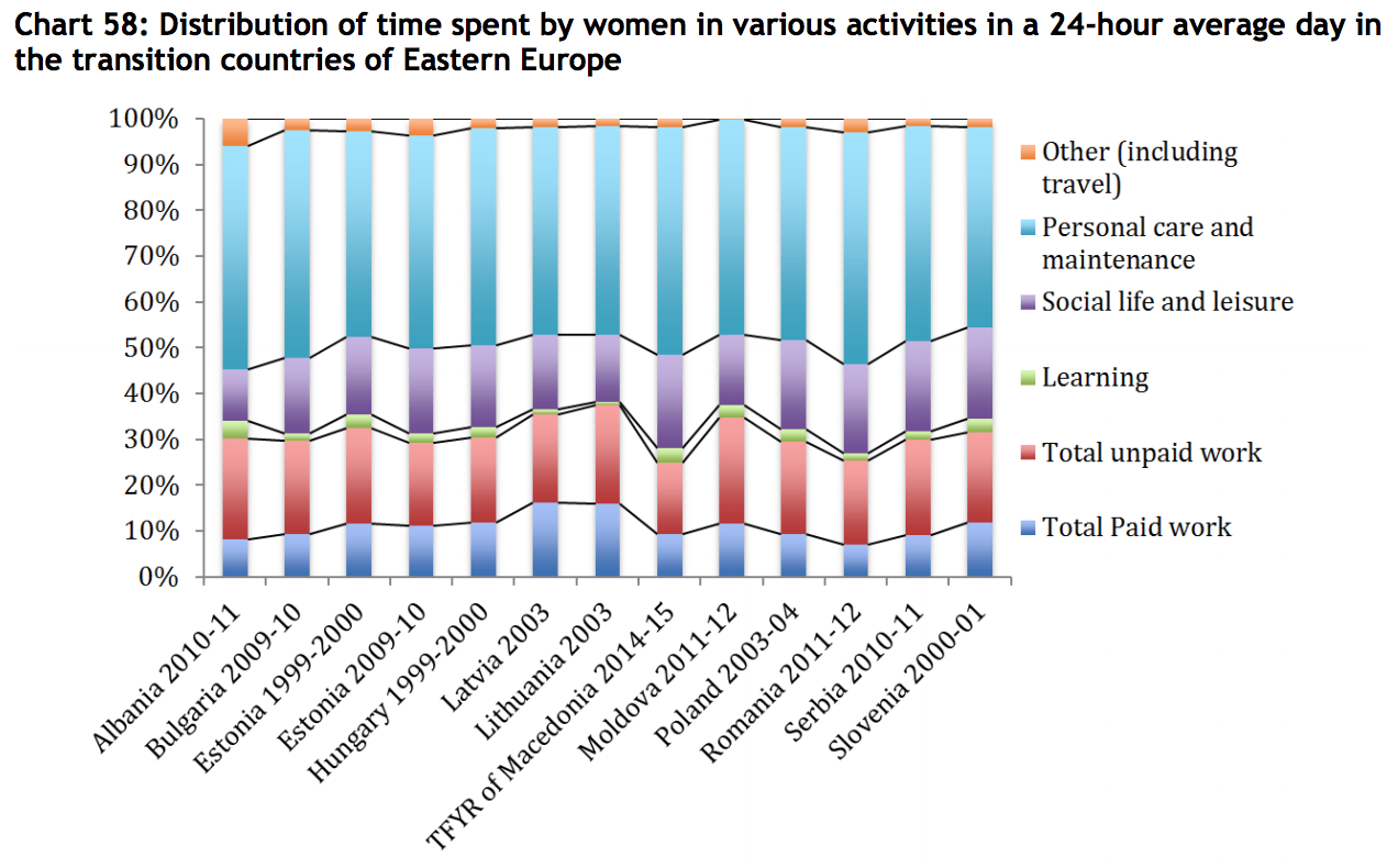
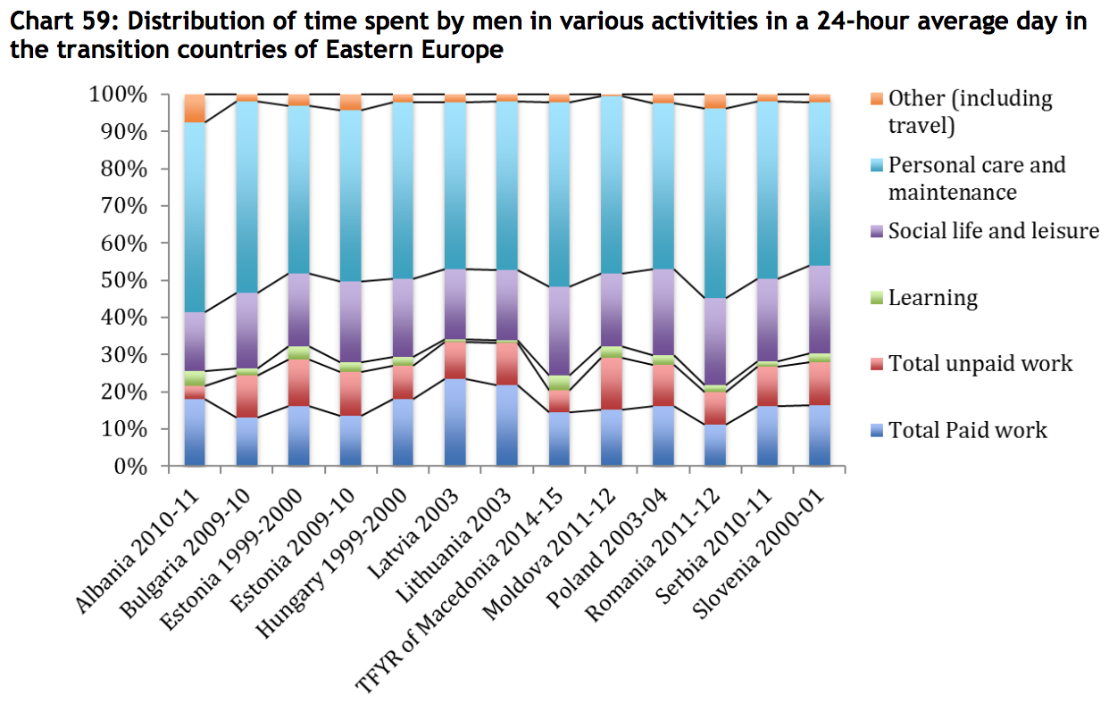
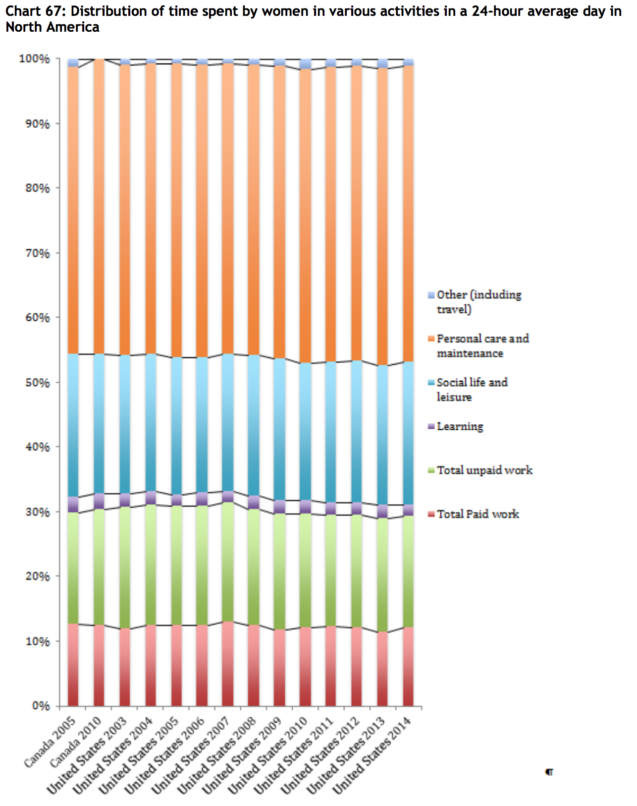
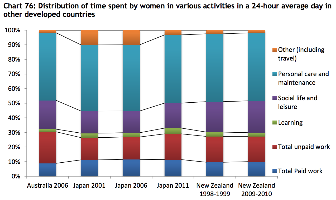
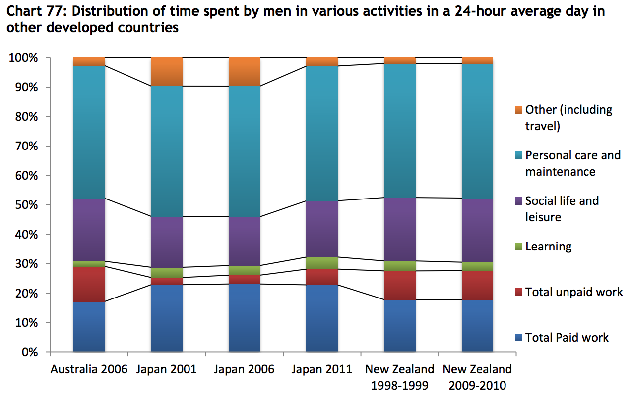
Paper is based on 102 time use surveys carried out in 65 countries. It gathers as many time use survey data and metadata as possible, and builds synthetic indicators on time use across the world, based on this data set. One of the main goals of the paper is to highlight time-use differences between men and women, particularly the inequities between paid work and unpaid work. To that end, most of the charts are divided by gender, with only a single chart showing gender-neutral time-use averages (that one chart is for the Mid East and Northern Africa region). In the case of Europe, the charts are further segmented by west, north, and southern Europe.
Survey data are aggregated into the following broad regions:
Middle East and North Africa (9 countries, 10 surveys)
sub-Saharan Africa (8 countries, 10 surveys)
Asia (9 countries, 13 surveys)
Latin America (7 countries, 8 surveys)
Europe (15 countries, 29 surveys)
Transition [Eastern European countries with Soviet history] (12 countries, 12 surveys)
North America (2 countries, 14 surveys)
Other developed countries (3 countries, 6 surveys)
The following chart shows which countries are included in those categories, and highlights which countries have conducted repeated surveys.
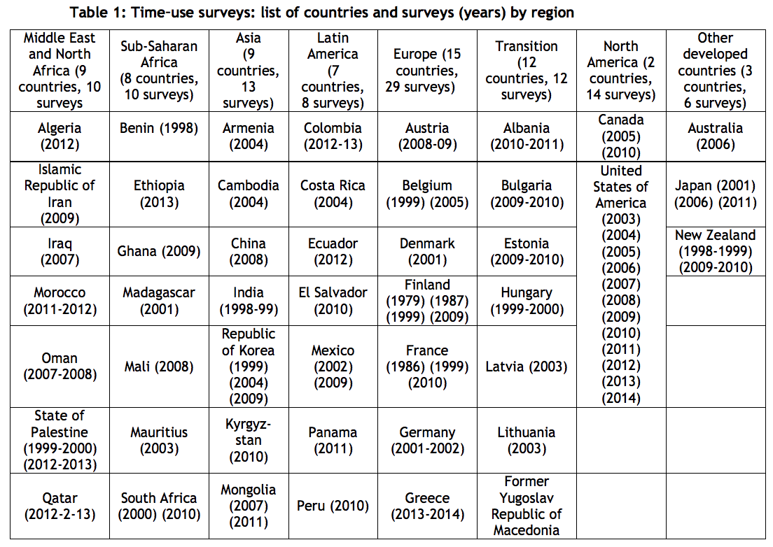
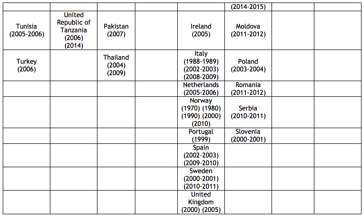
p.5,6
Here are the overall time-use charts from the report:
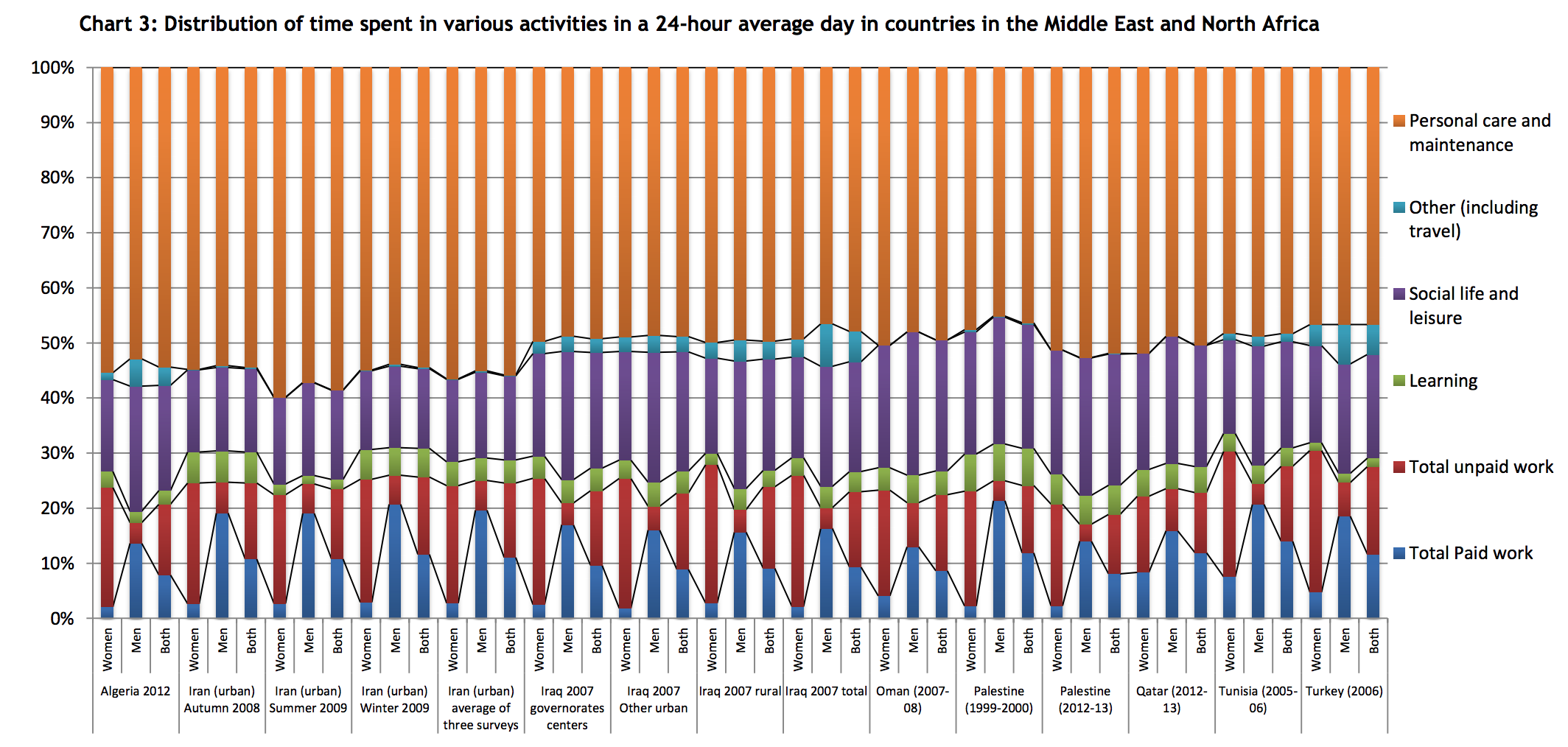
p.19

p.29

p.30
p.42
p.43
p.50
p.51
p.66
See the report for western and southern Europe segments. I’ve excerpted the northern Europe segment because it reflects a broad time series, with many repeated surveys in Finland and Norway.
p.67
See the report for western and southern Europe segments.
p.73
p.73
p.78

p.79
p.84
p.84
***
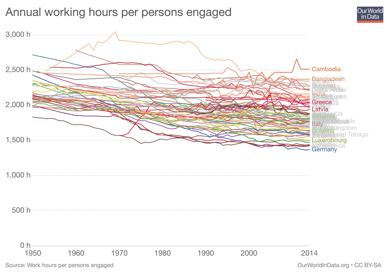
Annual Working Hours 1950-2014
worldwide
Reflects the trend of people in richer countries working less.
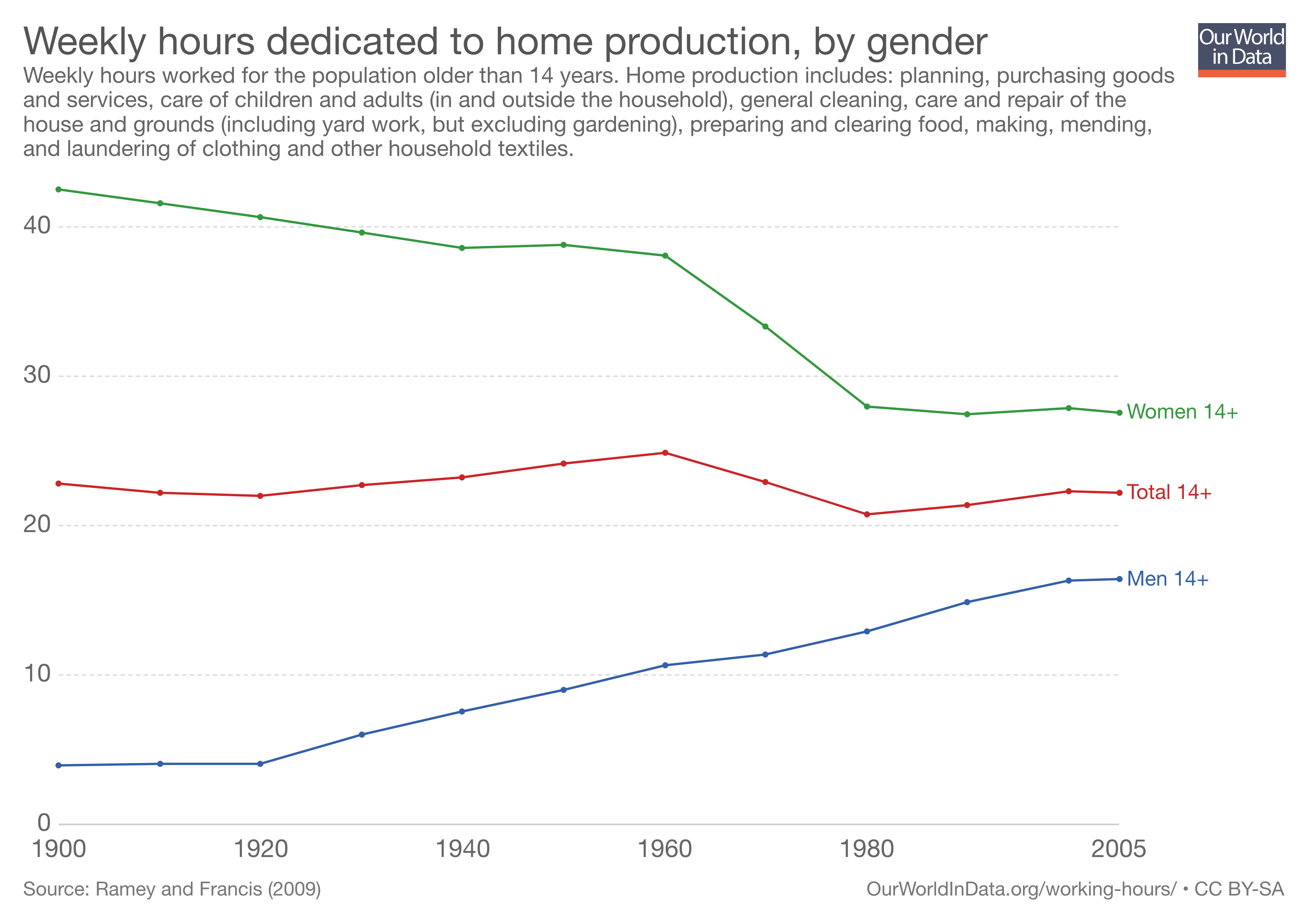
Working Hours in the Household 1900-2005
US
Marked decline for women and increase for men, across all age groups.
Includes planning, purchasing goods and services, care of children and adults, general cleaning, care and repair of the house and ground, preparing and clearing food, making, mending, and laundering clothing and other household textiles.
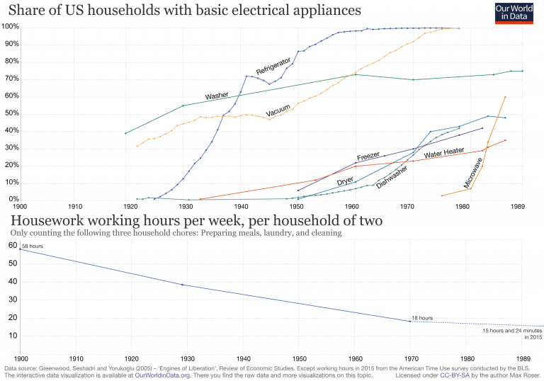
Hours per week on chores have decreased as electrical appliances have proliferated 1900-1989
US
Comparing share of households with basic electrical appliances to hours spent preparing meals, doing laundry and cleaning.
src:
Max Roser, 2018
“Working Hours” – Our World In Data
Mobile Data vs. Voice Usage
ASK: Looking for a visualization of mobile voice/text usage compared with data usage.
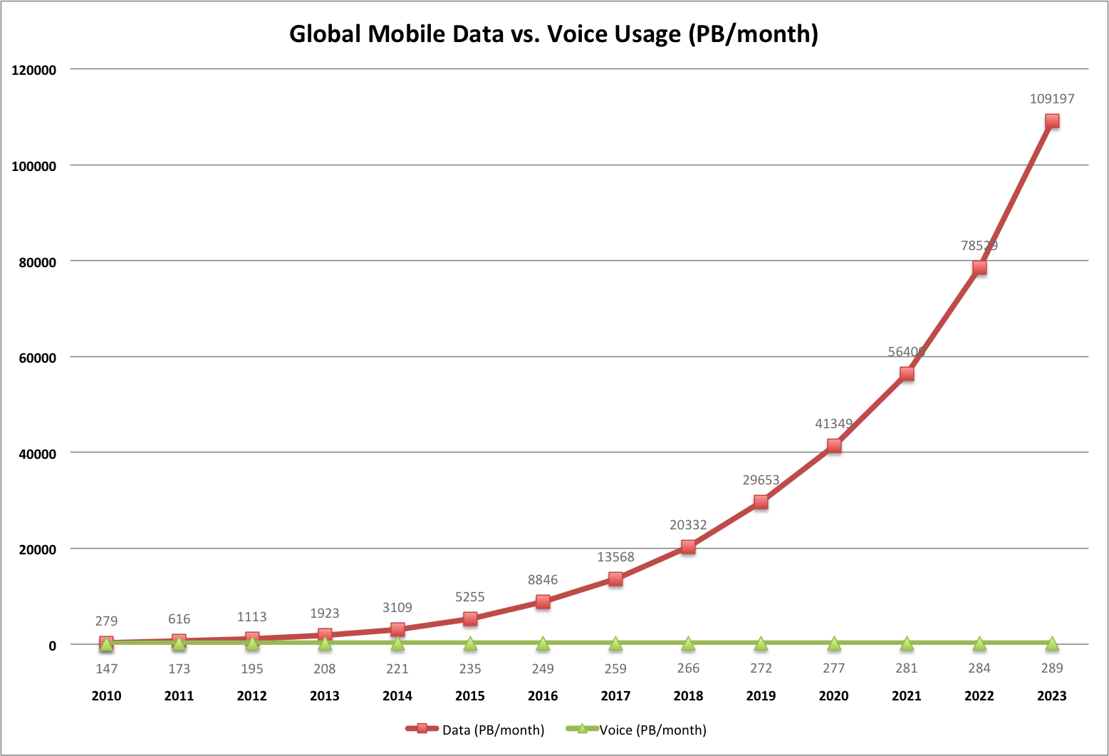
CC’s chart
data via Ericsson’s interactive Traffic Exploration tool
Google Drawing shared with KK
*
Akamai offers the following commentary on essentially the same historic data, also from Ericsson (emphasis mine):
Mobile data traffic has continued to grow, and Figure 39 shows total global monthly data and voice traffic from the first quarter of 2012 to the first quarter of 2017. It depicts a continued strong increase in data traffic, with voice traffic growth having diminished to the low single digits per year. The growth in data traffic is being driven both by increased smartphone subscriptions and a continued increase in average data volume per subscription, fueled primarily by increased viewing of video content. In the first quarter of 2017, data traffic grew nearly 12% quarter-over-quarter and nearly 70% year-over-year. Looking at the full five-year period shown in Figure 39, cumulative voice traffic growth was 28%, while cumulative data traffic growth was more than 1,200%.
referring to:
Figure 39: Total Monthly Mobile Voice and Data Traffic as Measured by Ericsson
Q1 2012 – Q1 2017
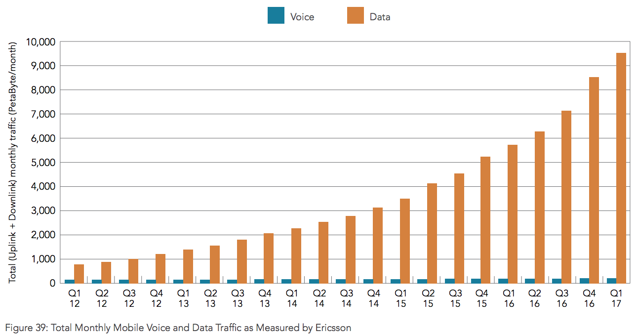
src:
Akamai, 2017
“The State of the Internet / Q1 2017”
p.46
citing Ericsson
*
Ericsson survey results and commentary on the expectations for 5G enabling VR/AR mobile applications:
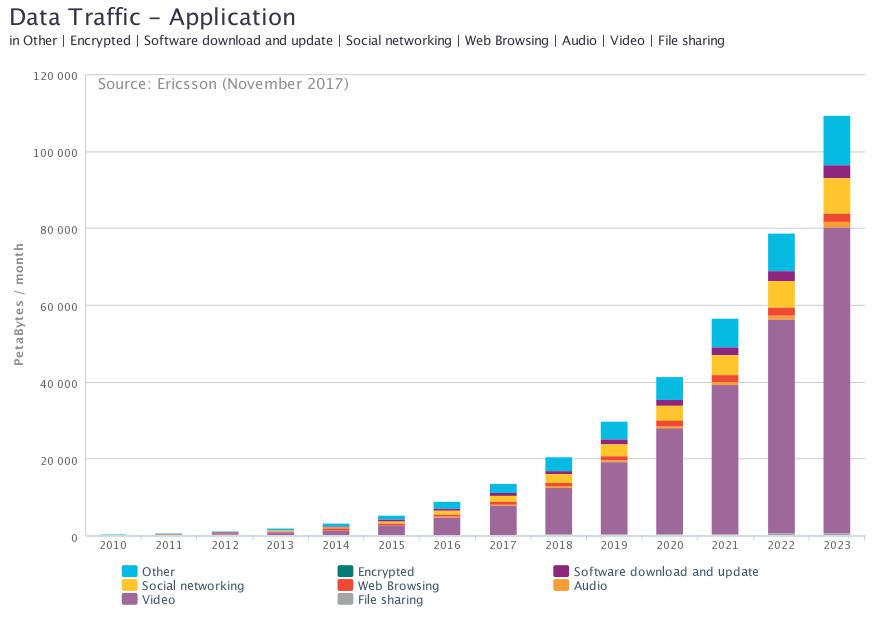
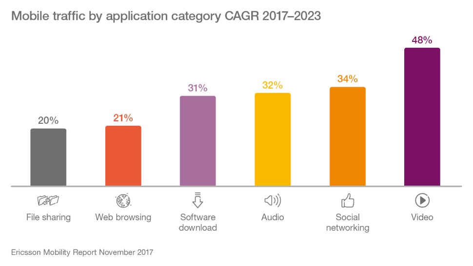
Video now accounts for over 50 percent of all mobile traffic – a figure that is expected to increase to over 75 percent by the end of 2023.
A recent survey* of consumers aware of VR in 8 countries suggested that 7 out of 10 early adopters expect VR/AR to fundamentally change everyday life. These early adopters expect 5G to play a significant role in enriching the shared VR experience by providing lower latencies, haptic feedback and higher resolutions.
In its current forms, AR may be much more suited than VR to mobile applications. However, the line between the two is already dissolving, with merged reality (MR), stereoscopic six degrees of freedom (6DoF) and holographic video on the horizon.
* Ericsson ConsumerLab, Merged Reality (June 2017) Base: 9,200 consumers aged 15–69 in France, Germany, Italy, Japan, South Korea, Spain, the UK and the US
src:
Ericsson, Nov 2017
“Millennials Expectations for 5G”
Ericsson: 5G impacts on sports events
Alongside November 2017’s Mobility Report, Ericsson offered some speculations on the effect 5G mobile service might have on sporting event spectators.
Excerpts:
Key findings
Growth in mobile traffic at events can be attributed to changes in user behavior, especially among younger people
Spectators now mainly share or stream live videos and engage with social networks at events, as well as increasingly creating and uploading their own content
Augmented reality (AR) and virtual reality (VR) technologies can enhance visitors’ and remote spectators’ experience of events, making them available in new ways
4G systems will continue to support event visitors with services, but in the near future, 5G technology will have the capability to transform their experience
At future events and connected venues, with high traffic density and increasing use of demanding services such as AR and VR, proactive management and automation will be essential to meet committed service levels
A range of services may be included in 5G showcases, allowing venue visitors to turn from spectators into participants and enabling them to:
Watch events from different viewpoints with interactive control
Access multiple cameras filming an object to achieve a 3D view
Experience sports activity from the perspective of the athlete via mini-cameras
Enjoy an in-stadium experience outside the venue through haptic or tactile feedback
View live holographic projections of athletes
Integrate supplementary content into their live streams
See athlete, event or venue statistics superimposed on their device display
Analyze and display performance data through sensors embedded in sports equipment
Receive real-time information on factors such as the speed and location of a ball
View overlay and substitution content, for example, explaining rules, giving more details and personalizing the experience
src:
Ericsson, Nov 2017
“From spectators to participants”
Social Media Users
Hootsuite and We Are Social publish an annual report detailing internet use and social media growth. In their 2018 report, they list the most active social platforms (slide 59), led by Facebook (2,167B MAUs), with WeChat at #5 (980M MAUs). Because Facebook is still not used in China (not broadly), we have added the Facebook and WeChat user figures to roughly approximate the number of people using social media. At 3.147B, this comes very close to the report’s estimate of active social media users (3.196B).
src:
We Are Social/Hootsuite, Jan 2018
“2018 Global Digital”
full set of slides
I tallied historic MAU data from Facebook (Q3 2008 – Q4 2017) and WeChat (Q2 2011 – Q2 2017)
src:
Facebook via Statista, Jan 2018
“Number of monthly active Facebook users worldwide as of 4th quarter 2017 (in millions)”
src:
Tencent via Statista, Aug 2017
“Number of monthly active WeChat users from 2nd quarter 2010 to 2nd quarter 2017 (in millions)”
I calculated this tally as a percentage of global population, to be compared against the percent of global internet users (reported by the Internet Telecommunications Union).
global population src:
United Nations, Department of Economic and Social Affairs, Population Division. World Population Prospects: The 2017 Revision. (Medium-fertility variant).
via Worldometers
I used Excel to create trend lines (2deg polynomial) showing when each set (internet users and social media users) might reach 100% saturation.
The data are collected in the following Excel file:
global-internet-users-ITU-2001-2017-extrap-to-2030
And a simplified Google Drawing is here:
https://docs.google.com/drawings/d/1qbYyLORAMPYAtwZkrZxN0-VTfjUpPLoZL-SV-z-IB9E/edit?usp=sharing
Other bits of interest:
Dragon Social, Oct 2017
“10 Most Popular Social Media Sites in China”
eMarketer, June 2017
“Percent of Internet users who use a social network at least 1x/month”
2016-2021
Business Insider, Sep 2016
“Messaging apps are now bigger than social networks”
[crossing chart]
2011-2017
100% Internet Penetration
ASK: Forecasts for global 100% internet users?
FINDINGS:
eMarketer publishes a ~5-year forecast of internet penetration every year. It’s most recent publicly accessible forecast showed a downward revision from the previous year’s forecast.
As of June 2016
2014 41.1%
2015 44.3%
2016 46.8%
2017 49.0%
2018 51.1%
2019 53.0%
2020 54.6%
src: eMarketer, June 2016
Revised, as of April 2017
2016 44.6%
2017 46.8%
2018 48.8%
2019 50.6%
2020 52.2%
2021 53.6%
This is the only significant forecast I’ve found for this indicator.
*
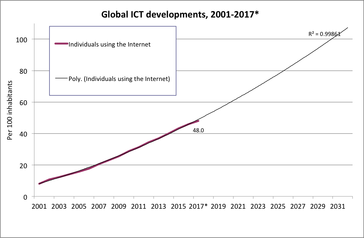
The International Telecommunications Union tracks internet users as a percentage of the global population. Historic data is available back to the mid 1990s.
I’ve added a trendline projection, which suggests ~2030 as a possible saturation date.
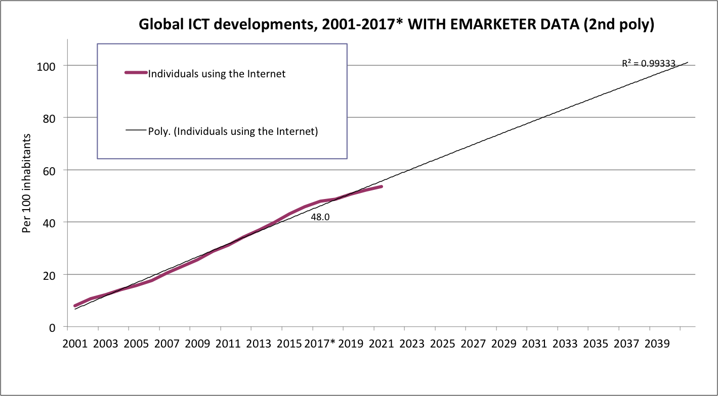
However, when eMarketer’s most recent forecast figures are added, the trendline wiggles. The same type of trendline (2nd order polynomial) then delays saturation until 2040.
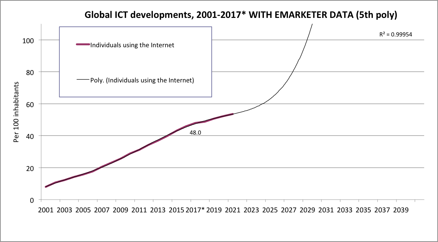
Adjusting the trendline type (to a 5th order polynomial) gives a better R-squared value, and again brings saturation back to ~2030.
[Black and yellow simplified chart here]
src:
International Telecommunications Union, 2017
“Global ICT developments, 2001-2017*” [XLS file]
Here’s a tidy chart, showing data points, of basically the same data (1997-2017) aggregated at Wikipedia, with separate lines for global, developed world, and developing world:
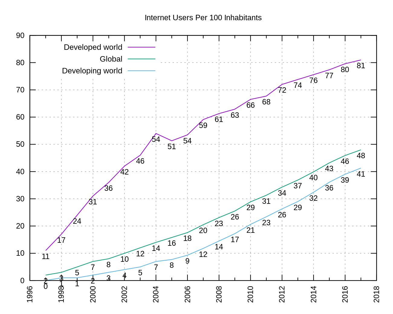
src: Wikipedia citing Internet Telecommunications Union
*
Newsweek projection of when the number of active Facebook users will equal the current (2017) population of the world (7.6B) — 2048
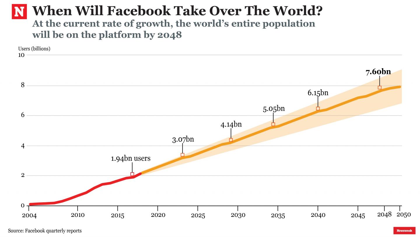
Newsweek’s fine print: The forecast has been calculated only using the annual figures provided by Facebook’s reports since 2004, and does not take into consideration technological progress or demographic changes.
CC’s NOTE: In 2048, the UN medium fertility variant projection for world population is 9.7 billion. At 7.6 billion users, that would be about 78% of the projected 2048 population. That would be a big jump from the 26% of global population FB users accounted for in 2017, but still not literally everyone.
src:
Newsweek, May 2017
“How Long Until Facebook Takes Over The World?”
Proliferation of cell sites and light bulbs
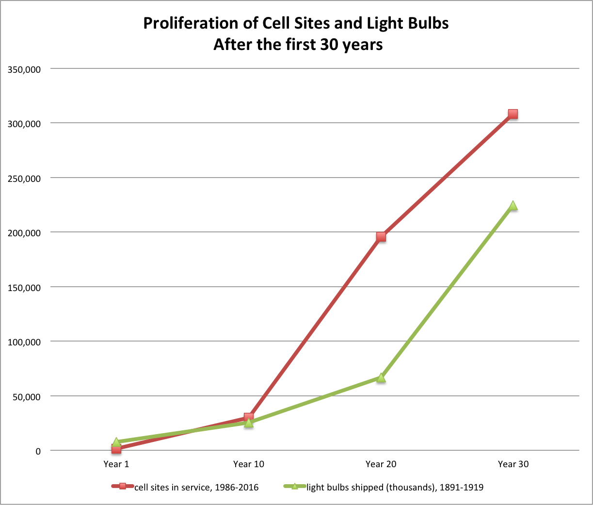
NOTE:
This chart reflects production of large incandescent lamps, which include the ordinary electric-light bulbs for residential, commercial, and industrial use. This category excludes miniature lamps such as those for motor vehicles, flashlights, and Christmas trees. (Bright, p.5, Note 2). Production of other types of lamps (miniatures, photofloods, etc) seem to’ve been fairly low in the first three decades of lamp production (1891-1919), but began to ramp up soon thereafter, certainly by 1939 (figures reported in Bright, p. 10), and by 1945 these other categories of lamps accounted for about 36% of total lamp production (calculated based on figures reported by the FTC in 1980, p.34).
DATA
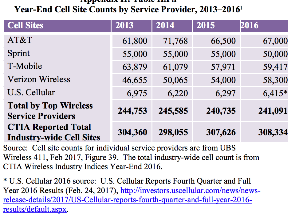
Cell sites in service
1986 1,531
1996 30,045
2006 195,613
2016 308,334
src:
CTIA, 2017
“Wireless Snapshot 2017”
Light bulbs shipped (thousands)
1891 7,500
1899 25,320
1909 66,776
1919 224,713
src:
MIT Studies of Innovation, 1949
Arthur A. Bright
“The Electric-Lamp Industry: Technological Change and Economic Development from 1800 to 1947”
p.4, Table I: The Production Of Large Incandescent Lamps In The United States 1879-1945
NOTE:
Data from these two sources is aggregated in CC’s Excel file: cell-sites-vs-light-bulbs.xls, which includes additional years of data (through 1945) for the light bulb industry, as well as calculated rates of growth.
*
Additional source for light bulb production
Federal Trade Commission, February 1980
“Staff Report on the Development and Structure of the U.S. Electric Lamp Industry”
Excerpts:
Total volume of light bulb industry
1912 90.8 million
1926 478.9 million (527% increase from 1912)
p.103
| Comparison of 1945 and 1974 Shipments of Various Types of Electric Lamps [thousands of units] |
|||
| Type of Lamp | 1945 shipments | 1974 shipments | Percentage change |
| Photographic | 36,447 | 2,406,332 | 6,502.3 |
| Large incan. | 794,402 | 1,532,039 | 92.9 |
| Miniature* | 337,325 | 964,016 | 185.8 |
| Fluorescent | 42,781 | 284,529 | 561.1 |
| Total | 1,250,689 | 5,395,942 | 331.4 |
p.34
*Of the 964,016 Miniature lamps shipped in 1974, 665,208 were used in automotive applications. (p.43)
citing:
U.S. Department of Commerce,_c: Bureau of the Census, Current Industrial Report: Series MQ-36B(74)-5, Electric Lamps, 1975; and U.S. Department of Commerce, Bureau of the Census, Facts for Industry: Electric Lamps, 1946.
Table 111-1 shows the U.S. value of shipments, exports, and imports in SIC 3641 for the years 1967 to 1973. During that time; imports never accounted for more than 6.79 percent of total domestic value of shipments while exports never accounted for more than 5.21 percent. When imports are added to value of shipments and exports subtracted from the whole, consumption can be found. Between 1967 and 1973, 93 percent of the total lamps consumed in the United States were manufactured in the U.S. In the same seven-year period, 94.8 percent of the lamps manufactured in the United States were used in the U.S.
p.38-40
***
OTHER BITS OF POSSIBLE INTEREST…
“Consumption Spreads Faster Today”
Chart shows historic penetration rates for new technologies – accelerating over time.
Includes electricity.

Other interesting excerpt:
At the average wage, a VCR fell from 365 hours in 1972 to a mere two hours today. A cellphone dropped from 456 hours in 1984 to four hours. A personal computer, jazzed up with thousands of times the computing power of the 1984 I.B.M., declined from 435 hours to 25 hours. Even cars are taking a smaller toll on our bank accounts: in the past decade, the work-time price of a mid-size Ford sedan declined by 6 percent.
src:
New York Times, February 2008
graphic src:
Nicholas Felton (not sure about data src, although many other version of this chart exist, so it must be widely available data)
And here’s an older version of the chart (1998), different illustrator, additional detail.
And another version, through 2010, which really emphasizes the acceleration of penetration rates.
*
U.S. Housholds by Type of Phone, 1900-2011
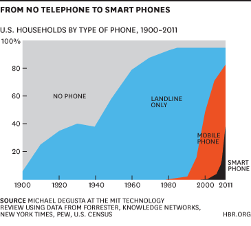
src:
Harvard Business Review, Nov 2013
graphic by:
Michael Degusta, MIT Technology Review
using data from Forrester, Knowledge Networks, Net York times, PEW, US Census
*
The History of the Light Bulb – US Department of Energy
Interactive timeline of light bulb technology
Light – Our World in Data
Price (1300 to current, UK), consumption (1700 to current, UK), and access (current, global) to lighting
Internet Connectivity and Infrastructure
Pew Internet/Broadband Fact Sheet
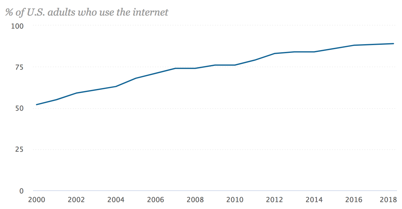
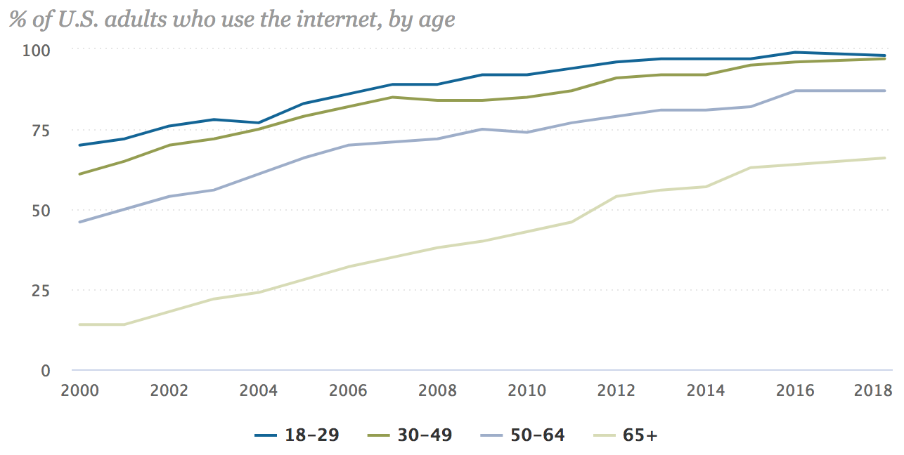


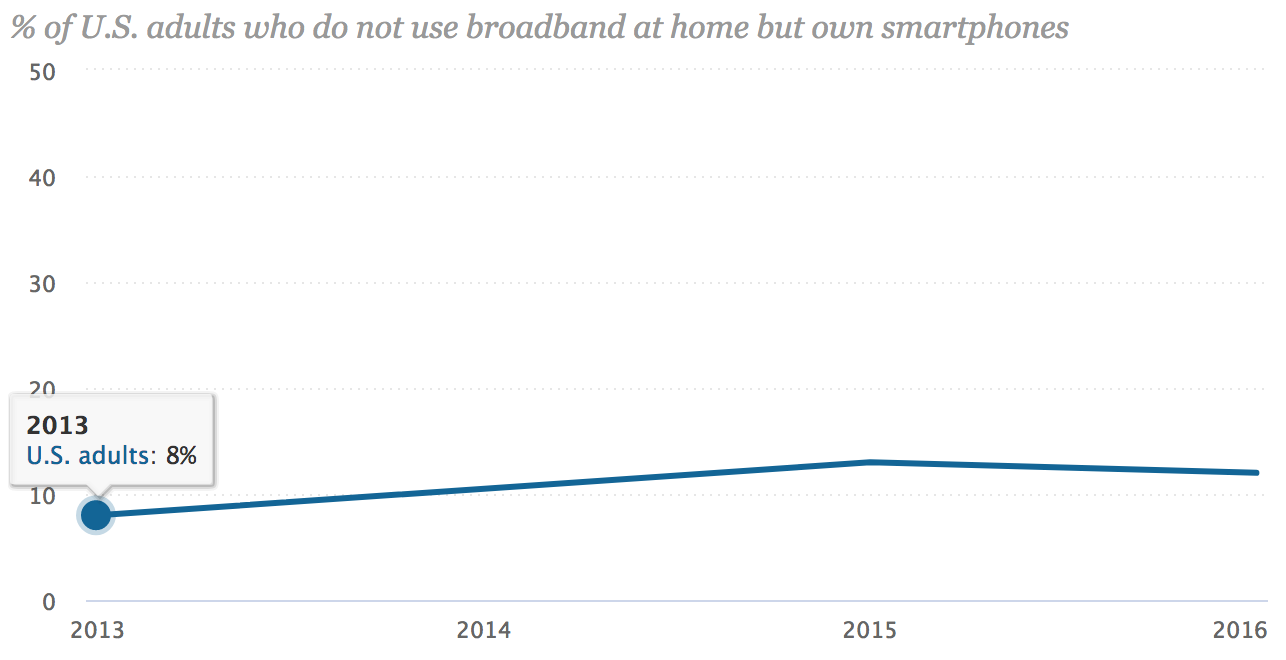
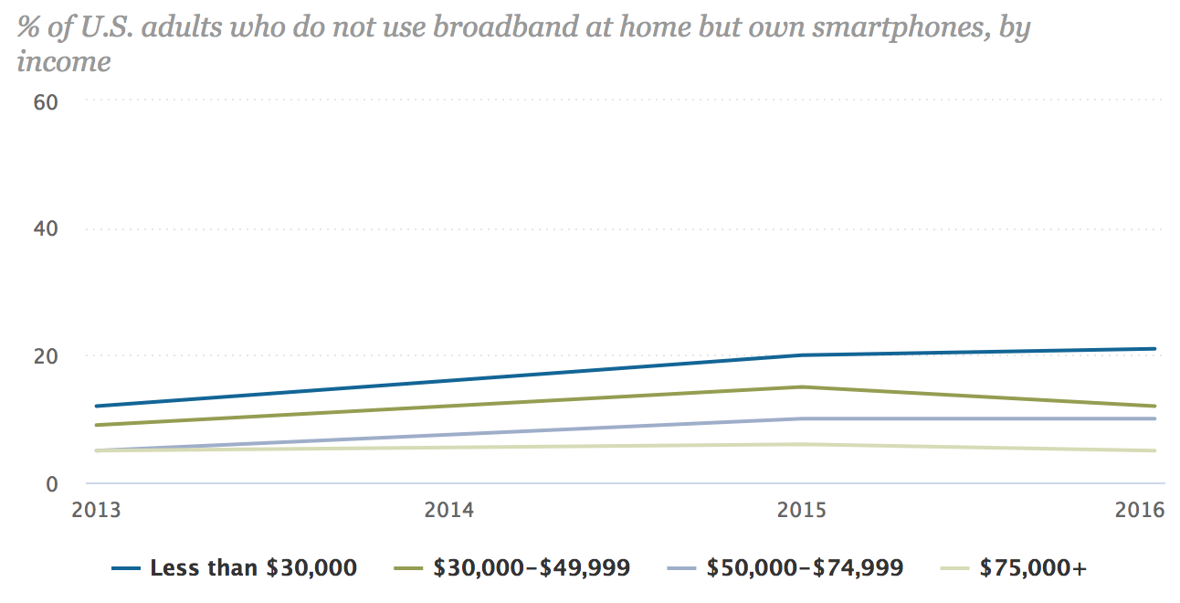
src:
Pew Research Center, Feb 2018
“Pew Internet/Broadband Fact Sheet”
*
FCC Fixed Broadband Deployment Map


See the source link for an interactive version of the map.
src:
FCC Fixed Broadband Deployment
Accessed April 2018
Note: Discussion of the FCC map and it’s latest version is available here. The latest map is based on 2016 data. FCC does not have an equivalent map for mobile broadband, although it does publish an annual report on mobile wireless competition.
*
20th Mobile Wireless Competition Report Quick Facts


src:
FCC, September 2017
20th Mobile Wireless Competition Report Quick Facts
A couple more interesting bits from the full report…
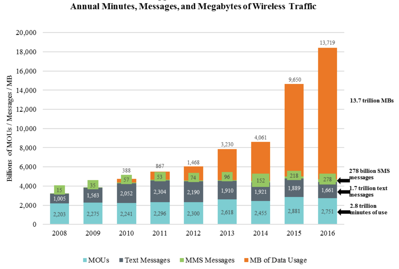
NOTE: MOU = minutes of voice use
[p.72]

Note: A “connection” is a paid subscription, equivalent to the number of ‘lines’ when discussing landline phone service.
[p.73]
[p.74]
Note: According to CTIA, there has been an approximate 57 percent growth in the number of cell sites over the last ten years (in 1986, there were 1,531 cell sites in service).
The report notes that, according to CTIA, the number of cell sites will significantly increase as the mobile wireless industry densifies and prepares for 5G. Also, because multiple cell sites can be co-located in the same “tower” site, the reported cell sites should not be equated with “towers.” The reported cell sites include repeaters
and other cell-extending devices (e.g., femtocells or distributed antenna systems).
A specialized communications tower industry has developed to provide and manage the
support structures for the cell sites. Today, there are more than 120 tower and DAS operators in the United States, and a majority of towers are now owned or operated by independent companies rather than by mobile wireless service providers.142 Independent tower operators own, operate and lease shared wireless communications and broadcasting towers, manage other tall structure sites (such as rooftops and water towers), and to a lesser extent, own and operate neutral facilities to host small cells and DAS networks for mobile service providers. [p.32]
src:
FCC, Sep 2017
“Implementation of Section 6002(b) of the Omnibus Budget Reconciliation Act of 1993, Annual Report and Analysis of Competitive Market Conditions with Respect to Mobile Wireless, Including Commercial Mobile Services”
*
[In the U.S.] Expected arrival time-frame for 5G roll out with decent coverage and availability in handsets:
early 2020s
(Although 2019 phones will be advertising capacity, even if there’s no network to connect to right away.)
“I believe that eventually consumers will pay for just one broadband connection, fixed and mobile. When I say 50M or more homes, I mean wireless substitution. I think you can draw a parallel with local telephone service and long distance. The long distance business evaporated. Similarly, today’s fixed and mobile broadband services will collapse into one. The cellular operators today are better positioned to take that market.” Peter Rysavy (wireless technologies consultant)
src:
Forbes, Sep 2017
“The Dawn Of 5G: Will Wireless Kill the Broadband Star?”
Ericsson (Nov 2017) has the same prediction for 5G, anticipating coverage for more than 20% of the global population (1 billion) by the end of 2023. First deployments are expected in 2019.
*
Submarine Cable Capacity

src:
Submarine Telecoms Industry Report 2017
[p.17]
*
Network World, Mar 2018
“Submarine cable boom fueled by new tech, soaring demand”
Excerpts:
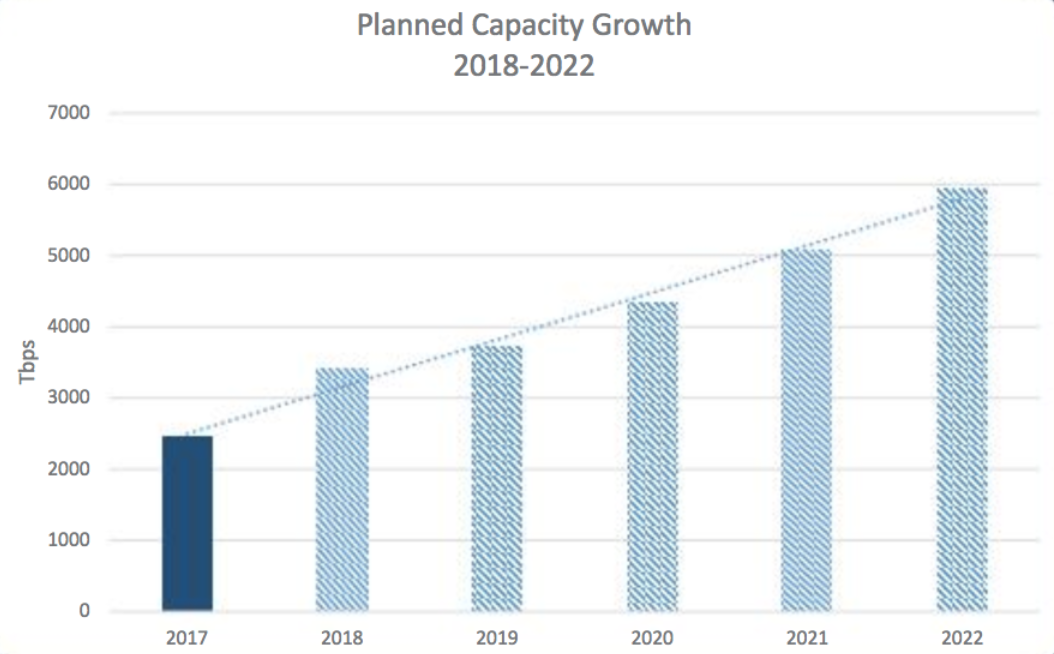
Between 2013 and 2017, the subsea cable industry has added an average of 32 percent of capacity annually on major submarine cable routes.
SubTel Forum projects global submarine cable capacity will increase up to 143 percent between 2017 to 2022, and it also notes that a construction boom is already underway. Last year, 62,000 miles of submarine cable was added globally. This, after global averages didn’t crack 19,000 miles of added cable between 2013 to 2016.
According to TeleGeography, the international capacity deployed by companies such as Google, Facebook, Microsoft, and Amazon rose 14-fold between 2012 to 2016. … By investing in them, these mega-companies get them built faster. They also get a level of control over construction, maintenance and operation that’s ultimately more economical than becoming a paying customer on a telecom’s cable.
[It’s now cheaper to build systems with greater bandwidth. In 2013, new systems averaged 9 terabits per second (Tbps) — multiple systems planned for 2018 and 2019 will have capacities of 60 Tbsp. Tech advances are also eliminating costly and complex infrastructure layers, such as regen equipment. In addition, new cables can land directly inside multi-tenant data centers, rather than a traditional cable landing station (CLS) on the beach.]
*
Telegeography, Nov 2017
“A Complete List of Content Providers’ Submarine Cable Holdings”
This article lists cables owned or strongly supported by Amazon, Facebook, Google, and Microsoft.
Excerpt:
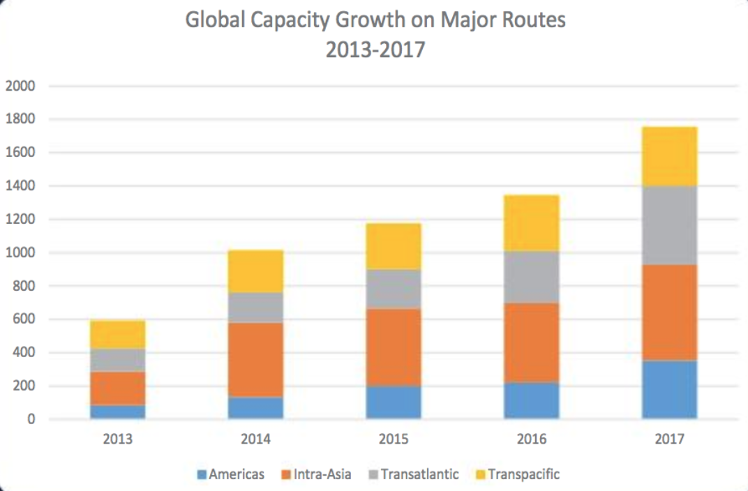
The amount of capacity deployed by content providers has outpaced all other customers of international bandwidth in recent years. Between 2012 and 2016 the amount of international capacity deployed by companies like Google, Facebook, Microsoft, and Amazon has risen 13-fold to 179 Tbps. (In contrast, international capacity deployed by all other operators only rose threefold, to 272 Tbps).
Content providers prioritize some submarine cable routes more than others in their network deployments. Between 2012 and 2016, content provider demand was the strongest across the Atlantic where capacity rose at a compound annual rate of 66 percent to 42 Tbps.
And as such, the largest content providers have built U.S.-centric network architectures. Their investments on systems directly connecting Europe to Asia are almost non-existent, in comparison. In the Atlantic and Pacific, content providers accounted for over half of total demand in 2016. In contrast, content providers represented only a small share of capacity usage on routes connected to the Middle East and Africa.
Used International Bandwidth by Source, 2002-2016

*
Submarine Telecoms Industry Report 2017
Excerpts:
Submarine fiber systems ownership
2013-2017: 61% private, 39% consortium
2018 and beyond: 83% private, 17% consortium
A recent trend towards private ownership has been observed compared to historical trends of primarily consortia ownership. Business cases for smaller systems have been prevalent, and the demand driving these systems has differed from years past. Globe-spanning infrastructure cables that require consortium ownership have fallen out of favor, contributing to this trend shift.
The boom of private ownership will continue to extend well into the future, as more niche and point-to-point systems are implemented. Much of this is driven by intra-regional needs — typically for smaller nations looking to get connected. However, a growing number of systems are being driven by factors not previously seen in the submarine fiber industry.
[p.22]
*
Norway Telecom Trends
The Norwegian Communications Authority prepares a twice annual report of statistics showing developments in electronic communications services, including fixed telephony, mobile telephony and services, broadband and TV transmissions.
See especially Chapter 2, Development Trends, stating on page 11
src:
Norwegian Communications Authority, May 2016
“The Norwegian Electronic Communications Service Market 2015”
Size of Homes, Global
Ask
What’s the size of average homes around the world?
Results
China & India Urban Residential Floor Space in 1993, 2002, 2008
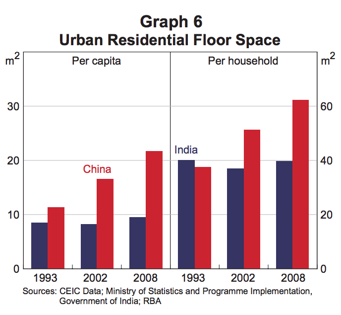
Excerpt:
Average income growth has been a key reason behind these different trends in the quality of the housing stock. The urbanisation process in China has transferred large numbers of workers from relatively low productivity jobs in the rural sector to higher productivity jobs in urban areas. This movement has been a driver of the rapid growth in incomes in China over the past three decades, which has far exceeded the growth in incomes in India (Graph 7). Over time, Chinese households have chosen to spend their higher income on higher quality dwellings and dwellings with larger floor space and, as a consequence, the share of concrete dwellings and residential floor space per capita has increased.
src:
Reserve Bank of Australia, March 2014
“Housing Trends in China and India”
p.66
*
Europe Compared with US Home Sizes, 1950, 1984, 2005, 2015
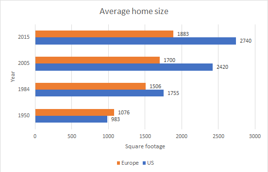
Note: This graphic is a very rough assembly of data reported in mass media publications (not well-cited).
src:
Reddit user chyken
“Comparing average house size in US to Europe, 1950-2015 [OC]”
citing US Census, Elle Decor, Apartment Therapy, Not Buying Anything
*
Europe Home Sizes (all vs. newly built)
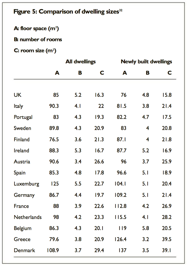
src:
Evans & Hartwich, 2005
“Unaffordable housing: Fables and myths”
p. 41
*
Europe, Australia, Canada, US, Japan (single year)
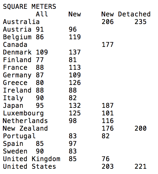
src:
Demographia (Wendell Cox), 2006 (data via IA)
“International House Sizes”
citing Japan Statistical Yearbook, European Housing 2002, Australian Bureau of Statistics, Canadian Home Builders Association, Infometrics.
*
Home Sizes: Select Europe, US, Canada, China, Australia, Japan (single year)
Note: Lots of overlap with Demographia set, above, but some additional countries
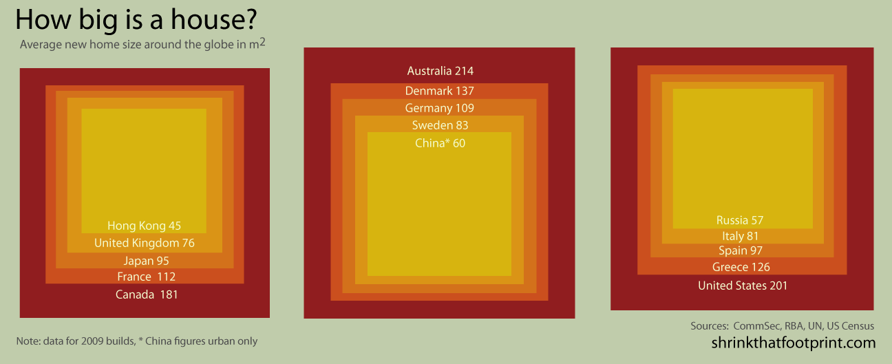
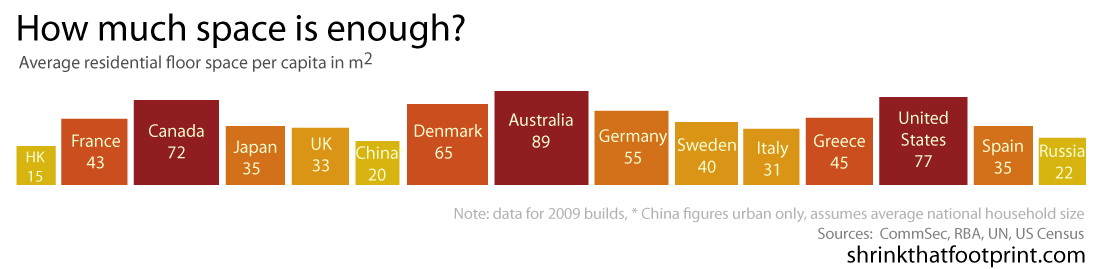
src:
Shrink That Footprint, 2013 (date via IA)
“How big is a house? Average house size by country”
